Discover and read the best of Twitter Threads about #30daymapchallenge
Most recents (17)
Here is a selection of the *coolest* 3D maps, visuals, and map-like worlds from the past months you don't want to miss. Wonderful dynamic, interactive, static, creative or artistic visuals PART 3. #Dataviz #3dMap #GIS #3D #Cartography #GISchat 1/20🧵
spatial_occasions | @spatial_occasions mesmerizing and stunning visualization of the flight networks on the Globe. Just perfect. Made in #Blender3D. #B3d #3DMap #GeometryNodes #Dataviz 2/🧵
Terence Fostodon's | @researchremora perfect mix of 3D and 2D with a brilliant style. Ultra productive 3D map maker, worth every follow! Made in #rstats with #rayshader. 3/🧵
🥳Free one hour mapping tutorial, tomorrow Thur 3 Nov at 13:00 UK time* (9am EST, 14:00 CET, 16:00 Istanbul, (00:00 Sydney, sorry)) - all welcome🥳
See image Alt text for description and Zoom link
#30daymapchallenge
See image Alt text for description and Zoom link
#30daymapchallenge
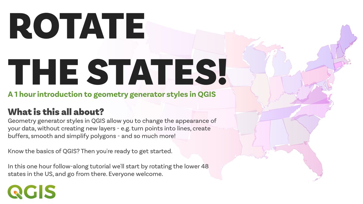
this is a bit of an experiment that I have been planning to do for a while so let's see how it goes - so long as you know the basics of QGIS you should learn some useful new stuff for design, and possibly more
I'll share lots of practical learning things in this short session, as well as styling tips for how to do all sorts of interesting design/effect things
「駅」の移り変わりを動画にしてみた。鉄道開業から150年、時代とともに鉄道の役割、顔つきが変わっていくのが興味深い。タイムマシンでこの地図の続きを見てみたい。(・ㅅ・)
#30DayMapChallenge Day 1: Points - Railway Stations in Japan
#30DayMapChallenge Day 1: Points - Railway Stations in Japan
北から南へ眺めてみる。
北海道の鉄道は栄枯盛衰。炭鉱が去り、中山間地域では人口減少が加速。生活インフラから地域のコミュニティまで、まさに"都市をたたむ"時代を迎えている。
※饗庭 伸 氏『都市をたたむ』・・・閉鎖(shut down)ではなく縮小(fold up)の意味
北海道の鉄道は栄枯盛衰。炭鉱が去り、中山間地域では人口減少が加速。生活インフラから地域のコミュニティまで、まさに"都市をたたむ"時代を迎えている。
※饗庭 伸 氏『都市をたたむ』・・・閉鎖(shut down)ではなく縮小(fold up)の意味
こちらは東北地方。
大動脈(東北本線など)から静脈(各都市を結ぶ中小路線)が生えていく様子が面白い。
※元データ(国土数値情報)には抜け漏れ・誤りがあります。全体的な変化を楽しんでいただければ。
大動脈(東北本線など)から静脈(各都市を結ぶ中小路線)が生えていく様子が面白い。
※元データ(国土数値情報)には抜け漏れ・誤りがあります。全体的な変化を楽しんでいただければ。
The #30DayMapChallenge 2022 starts tomorrow. In the last 2 years a lot of work has been put in @Stata to mainstream some of the map elements we find in other softwares. He is a 🧵 on the different types of maps one can make. If you want the code for any, just msg! Let's go 👇
The basic #spmap package can already do a lot! Here are some examples using standard spmap syntax.
These were made for the online #GIS tutorials earlier this year that were fairly well attended! Over 1400+ registrations and 500+ ppl online. Might repeat it again.


These were made for the online #GIS tutorials earlier this year that were fairly well attended! Over 1400+ registrations and 500+ ppl online. Might repeat it again.


The #bimap package that actually was the result of the #30DayMapChallenge last year allows you to combine two variables to check for interesting spatial correlations.
Install from SSC (ssc install bimap, replace)
See GitHub for further instructions
github.com/asjadnaqvi/sta…


Install from SSC (ssc install bimap, replace)
See GitHub for further instructions
github.com/asjadnaqvi/sta…


Do you love 3D maps, worlds & visualisations? Here are 24 world creators, mapmakers, or visuals I've come across recently. Brilliant and creative minds using many different tools! PART 1 #dataviz #GISchat #3dmaps #map #gis #3d 1/🧵
Steven Kay | @stevefaeembra creates many original and cool #3dmaps such as this great visualisation of Windturbines in the British Isles. Follow him! #Blender3D and #QGis are his tools. #SDGs #Wind #b3d 2/🧵
#30DayMapChallenge as #1Day30MapsChallenge Thread:
Weird alien eyeball? Or world population by latitude? Just another map experiment but since it fits with today's #30DayMapChallenge theme I'll share it here
statsmapsnpix.com/2021/11/world-…


statsmapsnpix.com/2021/11/world-…
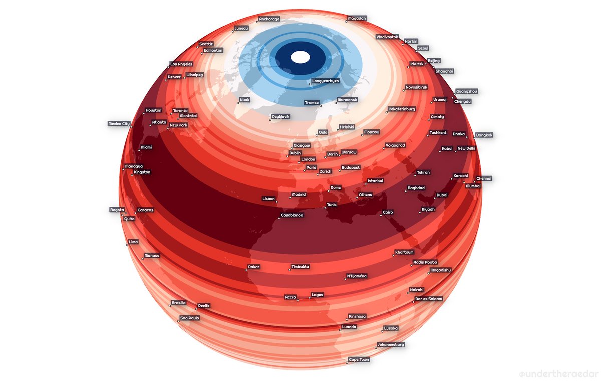


I included a population vs land by latitude gif too, because it seems people don't like to live in the sea
does it matter if you use WorldPop instead of GHSL? Not that much, but WorldPop has a 2020 version so I used that
Day 08: Blue
#30DayMapChallenge
Crimean native names in Southern Ukraine.
The map covers historic names of places (toponyms) used by people native to the area of the former Crimean state "Qirim Yurt" and around it.
#QGIS Data: qirimlide.wordpress.com
#30DayMapChallenge
Crimean native names in Southern Ukraine.
The map covers historic names of places (toponyms) used by people native to the area of the former Crimean state "Qirim Yurt" and around it.
#QGIS Data: qirimlide.wordpress.com

The project was initiated by Roman Alieiev, who lives in Germany and Crimean Tatar “QIRIMLI” initiative group.
See the video for more details
See the video for more details
Crimean Tatars are one of the main indigenous peoples of Ukraine. This is enshrined in law.
Post #30DayMapChallenge
Summarizing stats into a picture. Likes are only a number, most important is to enjoy the process.
⬇ One for each of the participants that made all the 30 maps
Summarizing stats into a picture. Likes are only a number, most important is to enjoy the process.
⬇ One for each of the participants that made all the 30 maps

@cj_maps had a total of 891 likes and 114 of retweets 

@Koen_VdE had a total of 824 likes and 79 of retweets 

#30DayMapChallenge - day 17: historical map
Let us take you on the epic journey of the Two Brothers in 1757, presented to us through the Prize Papers ⛵
In close collaboration with @stanpnnr
@UkNatArchives @Prize_Papers @jmeesvliz
(1/19)
Let us take you on the epic journey of the Two Brothers in 1757, presented to us through the Prize Papers ⛵
In close collaboration with @stanpnnr
@UkNatArchives @Prize_Papers @jmeesvliz
(1/19)
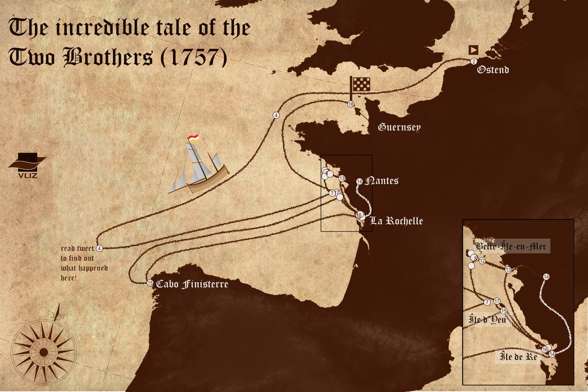
On 17 October 1757, Pieter Feliers, having received the command of the Two Brothers by his father, proudly leaves the port of Ostend in the Austrian Netherlands to deliver a cargo of flax, salted cod, and a copper tea kettle in the French port of Nantes. (2/19)
With the 28-year-old captain are a crew of 6 fellow Ostenders, among whom his second captain and friend since childhood, Pieter Jaeckx.
🗺️ hdl.handle.net/10934/RM0001.C…
(3/19)
🗺️ hdl.handle.net/10934/RM0001.C…
(3/19)
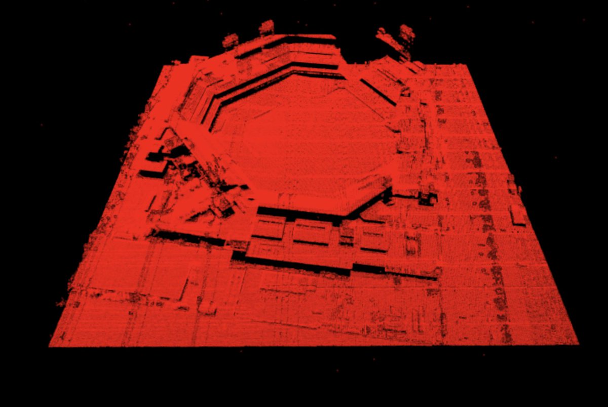
Going to do the #30DayMapChallenge with only baseball data... Should be fun.
Here's day 1 (Points).
#Phillies Citizens Bank Park LIDAR point data. 3.5 million data points.


Here's day 1 (Points).
#Phillies Citizens Bank Park LIDAR point data. 3.5 million data points.


Day 2 of the #30DayMapChallenge (Lines)... An animation breaking down where players that played in 2020 were born color coded by team and going to their home stadium.
Day 3 of #30DayMapChallenge (Polygons)... Here's a Voronoi diagram using #MLB stadium distances to create team boundaries. Pretty cool results. 

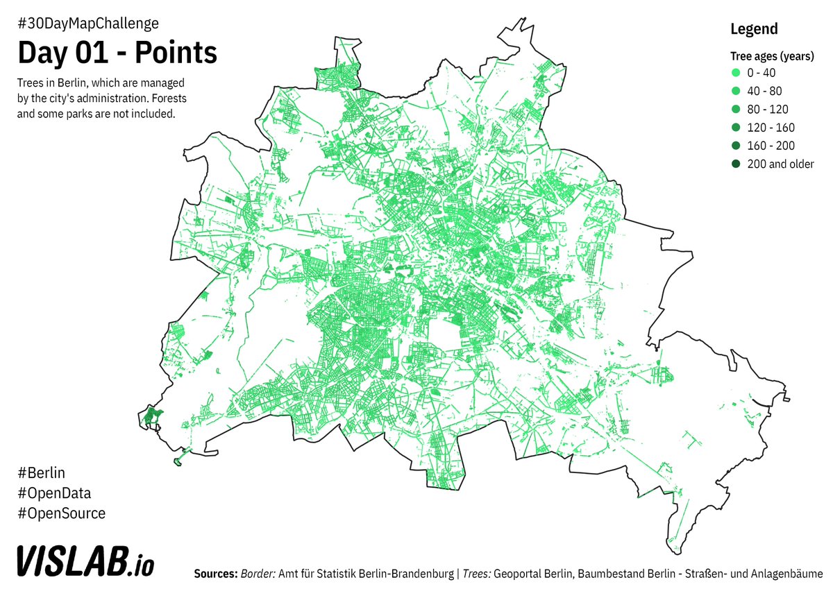
For this year's #30DayMapChallenge i will be trying to create 30 maps on #Berlin just using #OpenData and #OpenSource software. For day 01 - Polygons, a map of all of Berlin's street trees. #QGIS Source: github.com/sebastian-meie… 
BTW @citylabberlin has built an #FOSS platform for visualising and managing joint efforts for watering trees during dry periods in the summer: giessdenkiez.de Source code: github.com/technologiesti…
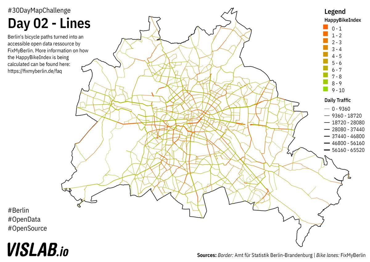
Day 2 of #30DayMapChallenge : Lines. Bike lanes in Berlin provided by @FixMyBerlin's API, showing their HappyBikeIndex. To explore the data set more in depth check out: fixmyberlin.de/zustand Code: github.com/sebastian-meie… 
#30DayMapChallenge
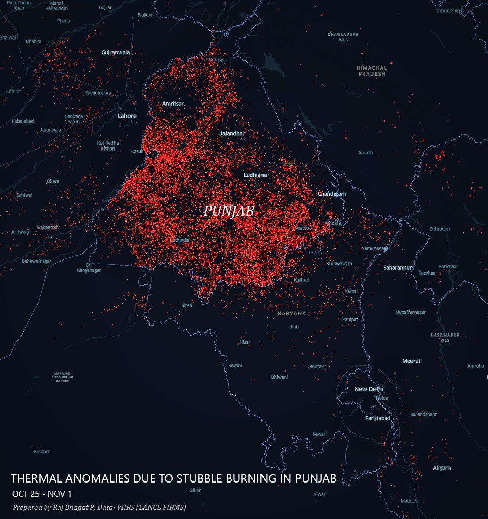
Map 1: Points
Thermal anomalies observed across Northern India in the last one week. These are primarily stubble-burning crop fire incidents in #Punjab.
Map 1: Points
Thermal anomalies observed across Northern India in the last one week. These are primarily stubble-burning crop fire incidents in #Punjab.
#30DayMapChallenge
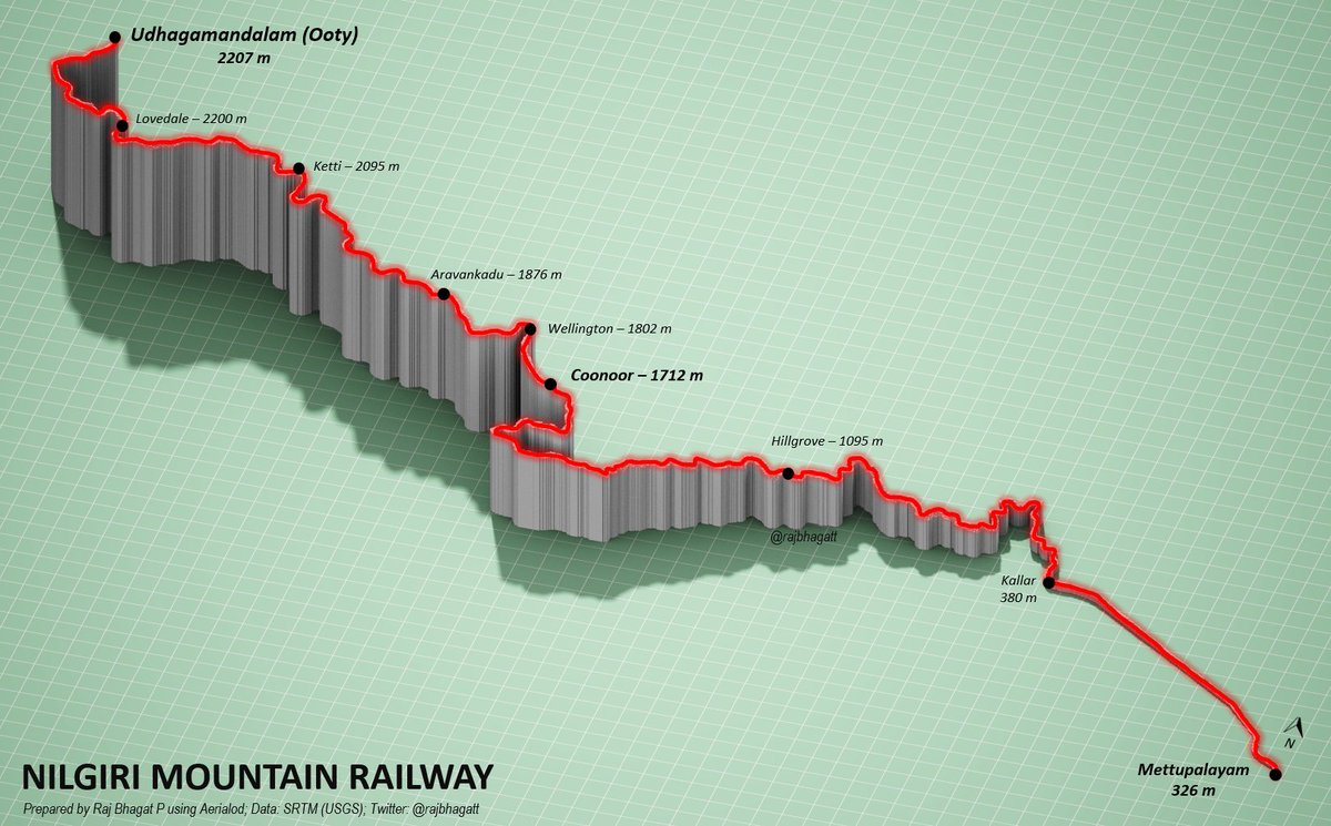
Map 2: Lines (Only one line though 😋)
#Viz shows the elevation profile of Nilgiri Mountain Railway in Tamil Nadu which is an UNESCO world heritage site
Map 2: Lines (Only one line though 😋)
#Viz shows the elevation profile of Nilgiri Mountain Railway in Tamil Nadu which is an UNESCO world heritage site
#30DayMapChallenge
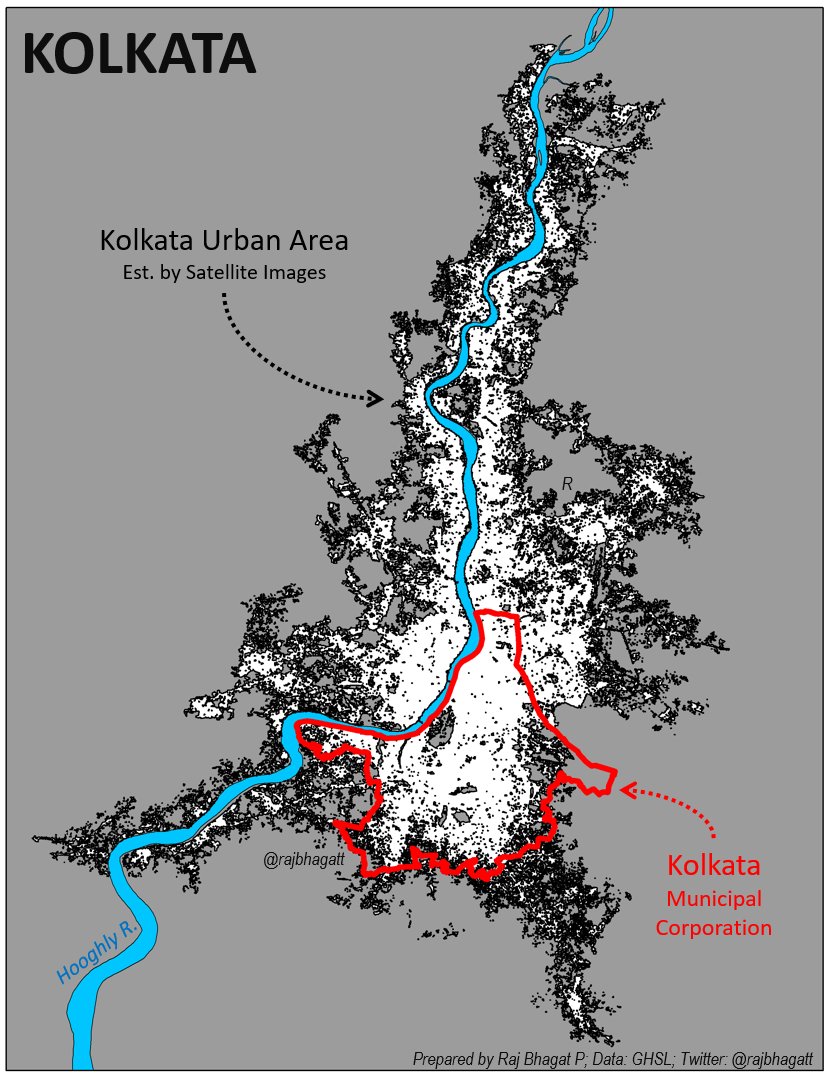
Map 3: Polygons
#Map shows 3 Polygon layers for #Kolkata City
1. Municipal corporation -in 🔴
2. Kolkata Urban Area -Satellite est. -in ⬛️
3. Hooghly River -in 🔵
DYK: More than 2/3rds of Kolkata's urban agg population lives outside the Kolkata Corporation?
Map 3: Polygons
#Map shows 3 Polygon layers for #Kolkata City
1. Municipal corporation -in 🔴
2. Kolkata Urban Area -Satellite est. -in ⬛️
3. Hooghly River -in 🔵
DYK: More than 2/3rds of Kolkata's urban agg population lives outside the Kolkata Corporation?
The moment you’ve been waiting for! Welcome to North Road’s 2019 #24daysofQGIS. It’s our gift to you! Follow this thread to learn new tricks and tips to try in #QGIS. Every day a new bite-size, cinnamon-scented mapping treat to get you through to Christmas Day... 🎄🎁🌎
(This year we'll provide some tips that are accessible to all spatial people, regardless of your software of choice. We don’t want our #arcgis #mapinfo friends excluded! We'll be showing all examples in our software of choice - #QGIS, but we hope you can apply them to yours 👫🌏)
In 2019 we’ve been inspired by many beautiful looking maps (we’re looking at you #30daymapchallenge!), so this year we are dedicating #24daysofqgis to #dataviz, and sharing with you our insider tips to beautify your maps and data! 🗺️ Let’s begin...
Quick plot of my travels from home in Sheffield and back over the past few years, for the final #30DayMapChallenge - the vast majority of this is on trains, including the west Highlands and the amazing Glenfinnan Viaduct 

other thoughts on this
- being on the internet, under the English Channel, in a train in the Channel Tunnel never stops feeling futuristic
- I feel at 'home' anywhere with decent tea and Marmite
- location history has me in Singapore multiple times, which I have no memory of
- being on the internet, under the English Channel, in a train in the Channel Tunnel never stops feeling futuristic
- I feel at 'home' anywhere with decent tea and Marmite
- location history has me in Singapore multiple times, which I have no memory of
Here's my first map in #30DayMapChallenge (late start)
Animation shows population growth in India's big cities between 1901 n 2011. Rapid Urbanisation holds lot of challenges!
I've been working in @WRICitiesIndia for last 5 years in trying to make our cities more sustainable
Animation shows population growth in India's big cities between 1901 n 2011. Rapid Urbanisation holds lot of challenges!
I've been working in @WRICitiesIndia for last 5 years in trying to make our cities more sustainable
Late start but I'll catch up!
