Discover and read the best of Twitter Threads about #dataviz
Most recents (24)
📢 Learn bioinformatics on your own, online 💻, for free, any time, any place 🌎 with the @ISBSIB e-learning courses!
👉 sib.swiss/training/e-lea…
#Training #lifesciences
👉 sib.swiss/training/e-lea…
#Training #lifesciences

From UNIX programming for beginners
👉 sib.swiss/training/cours…
#Training #lifesciences #bioinformatics
👉 sib.swiss/training/cours…
#Training #lifesciences #bioinformatics

to exploring and visualizing your data with #Python!
👉 sib.swiss/training/cours…
#Training #DataScience #dataviz
👉 sib.swiss/training/cours…
#Training #DataScience #dataviz

1/6 #OrderBookAnalysis 🧵
TLDR: Liquidity=Sentiment
Liquidity placement in the order book reveals #Sentiment for a price range! 📊📈
💧 When more liquidity is concentrated around a particular price level, it indicates increased confidence or interest from #traders...
TLDR: Liquidity=Sentiment
Liquidity placement in the order book reveals #Sentiment for a price range! 📊📈
💧 When more liquidity is concentrated around a particular price level, it indicates increased confidence or interest from #traders...

2/6 Analyzing the order book with a #DataViz tool like #FireCharts helps you mitigate risk by replacing speculative decisions with data based decisions.
No reason to speculate when you can literally see where higher concentrations of liquidity mark resistance and support.
No reason to speculate when you can literally see where higher concentrations of liquidity mark resistance and support.

3/6 Knowing where liquidity ISN'T, is as important as knowing where it is. Thin liquidity indicates zones with greater potential for volatility since price moves through them with less friction.
But there is one more aspect of #OrderBookAnalysis I personally value the most...
But there is one more aspect of #OrderBookAnalysis I personally value the most...

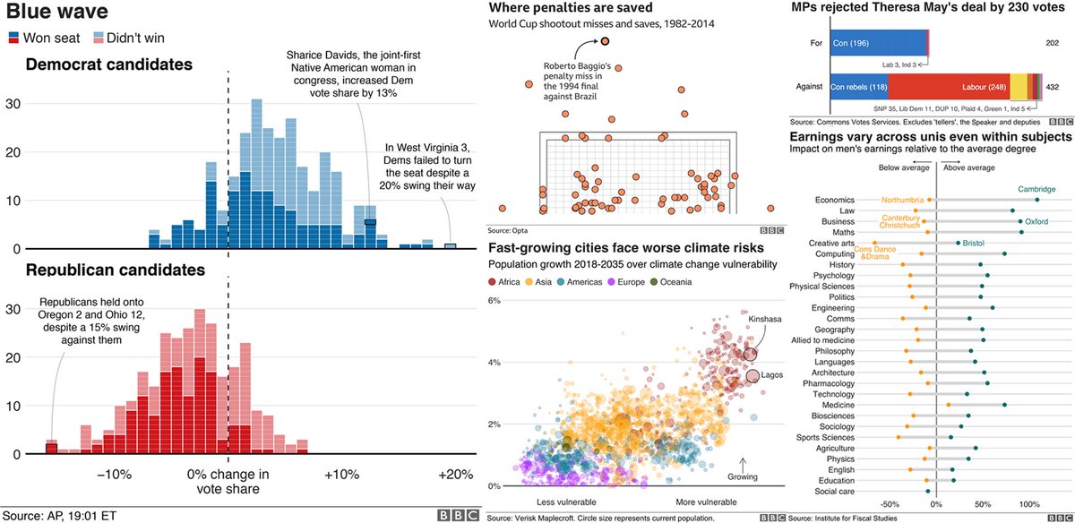
I used to think tables are boring.
But they can be beautiful & engaging.
Here's a nice example from @infobeautiful.
It uses many eye-catching elements but you don't need them to create a great table.
Just stick to these guidelines 🧵#dataviz
But they can be beautiful & engaging.
Here's a nice example from @infobeautiful.
It uses many eye-catching elements but you don't need them to create a great table.
Just stick to these guidelines 🧵#dataviz

1/10: 🧪📊 Introducing Generalized Linear Models (GLMs) and how to perform them using R! A thread. #GLM #Rstats #DataScience 

2/10: 💡GLMs are a general class of regression models that extend linear regression, allowing for a variety of response distributions & link functions. They're used for modeling relationships between a response variable & one or more explanatory variables. #RStats #DataScience
3/10: 📐The main components of a GLM are:
Random Component: The response variable's distribution (e.g., Gaussian, Poisson, Binomial)
Systematic Component: Linear predictor (linear combo of explanatory variables)
Link Function: Connects the two components. #Rstats #DataScience
Random Component: The response variable's distribution (e.g., Gaussian, Poisson, Binomial)
Systematic Component: Linear predictor (linear combo of explanatory variables)
Link Function: Connects the two components. #Rstats #DataScience
[1/8] 📚 Introducing #Quarto: A Versatile, New and Exciting Publishing Tool! 🌟
Quarto is a powerful, open-source, and user-friendly publishing framework that streamlines the process of creating beautiful books, documents, and websites. Let’s explore it now!
#RStats #DataScience
Quarto is a powerful, open-source, and user-friendly publishing framework that streamlines the process of creating beautiful books, documents, and websites. Let’s explore it now!
#RStats #DataScience

[2/8] 🤓 Language Agnostic: Quarto works seamlessly with multiple languages, including #Markdown, #LaTeX, #RMarkdown, and #Jupyter notebooks. So, whether you're a researcher or a creative writer, Quarto has you covered! 🌍
#DataScience #RStats
#DataScience #RStats
[3/8] 🔁 Format Flexibility: With Quarto, you can convert your content into various formats, such as PDF, HTML, EPUB, and even slide presentations. It makes sharing your work with diverse audiences a breeze! 🌬️
#RStats #DataScience
#RStats #DataScience
1/ 📊 Advanced Data Visualization in R: ggplot2 and Beyond 🎨 Take your data storytelling to the next level! In this thread, we'll explore advanced techniques for creating beautiful, informative, and interactive visualizations in R. #rstats #AdvancedR #DataViz #DataScience 

2/ 🎨 ggplot2: Enhance your ggplot2 graphics with:
•Custom themes and color palettes
•Faceting for small multiples
•Adding annotations and labels with ggrepel
•Incorporating custom geoms and stats
•ggplotly for interactive ggplot2 graphs
#Rstats #DataScience #DataViz
•Custom themes and color palettes
•Faceting for small multiples
•Adding annotations and labels with ggrepel
•Incorporating custom geoms and stats
•ggplotly for interactive ggplot2 graphs
#Rstats #DataScience #DataViz
3/ 🌐 Interactive Visualization: Create engaging, interactive visuals using:
•plotly for interactive charts and graphs
•highcharter for Highcharts-based visualizations
•leaflet for interactive maps
•dygraphs for time series data
#Rstats #DataScience #DataViz #AdvancedR
•plotly for interactive charts and graphs
•highcharter for Highcharts-based visualizations
•leaflet for interactive maps
•dygraphs for time series data
#Rstats #DataScience #DataViz #AdvancedR
1/ 🌟 R's Hidden Gems: Lesser-Known Functions and Packages You Need to Know! 🎉 Discover powerful functions and packages that can help you become an R power user. Let's dive in and learn together! #rstats #AdvancedR #DataScience 

2/ 🧙♂️ Functions: R has many built-in functions that often go unnoticed. Here are a few:
•with(): Apply expressions to a data frame without using the $ operator
•switch(): Simplify conditional expressions
•do.call(): Call a function with arguments in a list
•with(): Apply expressions to a data frame without using the $ operator
•switch(): Simplify conditional expressions
•do.call(): Call a function with arguments in a list
3/ 📦 janitor: Clean and preprocess your data with ease. Functions like clean_names() and remove_empty() make your data tidier and more manageable. Say goodbye to messy data frames! #rstats #datascience
A STN lança hoje a história “Deslocamentos e gastos hospitalares dos municípios brasileiros”, que traz dados sobre deslocamentos feitos por cidadãos em busca de tratamentos de saúde não fornecidos em suas cidades de origem.
#rstats #dataviz #EconTwitter
…atendimento-hospitalar.tesouro.gov.br


#rstats #dataviz #EconTwitter
…atendimento-hospitalar.tesouro.gov.br


Constatou-se que cerca de um terço dos atendimentos médicos foi prestado a pessoas de outros municípios. A cidade brasileira que mais recebeu pacientes de outras cidades foi Recife, superando inclusive São Paulo em valores absolutos. #atendimentohospitalar #Recife #SãoPaulo 

Os dados foram obtidos da base de atendimentos hospitalares do DATASUS, em cruzamento com os dados do IBGE e da STN. A maioria das cidades de pequeno porte possui gastos bastante inferiores às de médio e grande porte. #opendata
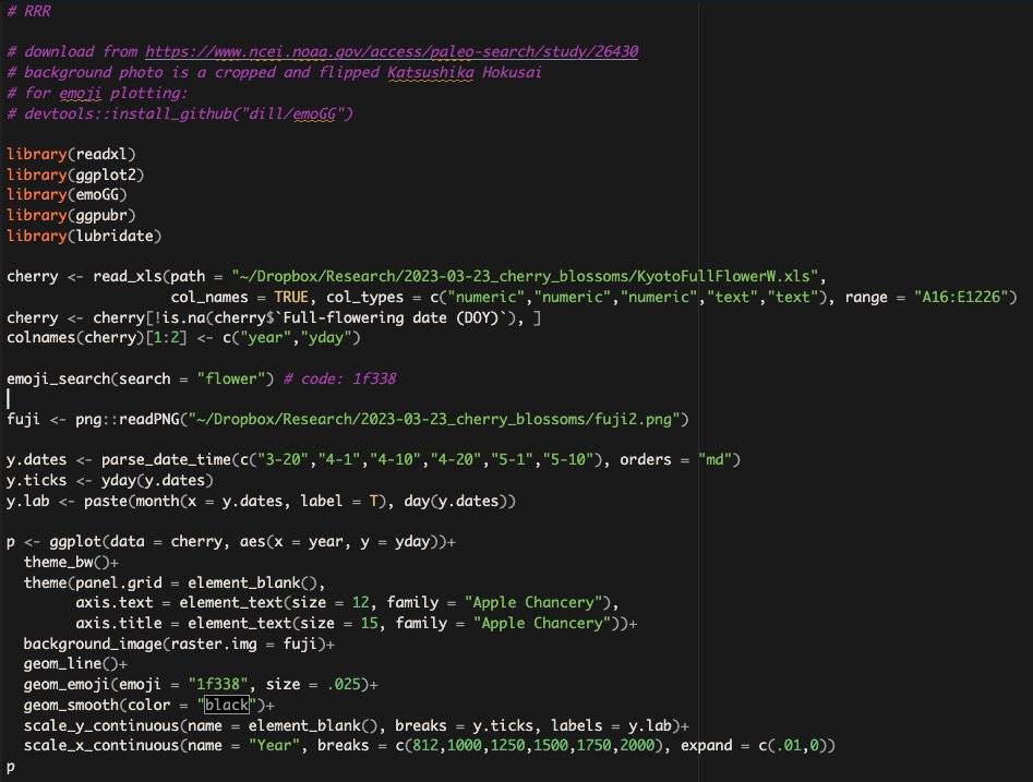
Mom asked, "I wonder when cherries bloom in Japan?" So I found 1200 years of data online and made her a plot. 

big shout out to emoGG package 🌸🌸🌸
data source: ncei.noaa.gov/access/paleo-s…
data source: ncei.noaa.gov/access/paleo-s…
" Data Analyst Project on Hotel Booking "
That you can add in your resume or portfolio to showcase your skills 💯
🧵
That you can add in your resume or portfolio to showcase your skills 💯
🧵
◻ In Recent Year , City Hotel & Resort Hotel have seen High Cancellation Rates. Each Hotel is now Dealing with number of issue as result including Fewer #revenue & Less than ideal Hotel room use.
🔹 Insights :
1️⃣ More Cancellation occur when prices are higher
2️⃣ When there is Longer waiting list , Customer tend to Cancel more frequently
3️⃣ The majority of Clients are coming from a offline #travel agents to make their #reservations
1️⃣ More Cancellation occur when prices are higher
2️⃣ When there is Longer waiting list , Customer tend to Cancel more frequently
3️⃣ The majority of Clients are coming from a offline #travel agents to make their #reservations
" SQL Interview problem "
🧵
🧵
This is a REAL SQL Interview question that might seem impossible to solve just by using SQL at first. But during the video the problem by breaking it into multiple parts
#SQL #DataScience #DataCleaningchallenge #DataAnalytics #dataviz #MachineLearning #deeplearning
#SQL #DataScience #DataCleaningchallenge #DataAnalytics #dataviz #MachineLearning #deeplearning
Youtube Video Link -
" SQL Puzzle Interview Question "
🧵
🧵
Table script:
create table input (
id int,
formula varchar(10),
value int
)
insert into input values (1,'1+4',10),(2,'2+1',5),(3,'3-2',40),(4,'4-1',20);
create table input (
id int,
formula varchar(10),
value int
)
insert into input values (1,'1+4',10),(2,'2+1',5),(3,'3-2',40),(4,'4-1',20);
" Exploratory Data Analysis on Terrorism "
🧵
🧵
We are performed Exploratory Data Analysis on terrorism #dataset to find out the hot zone of #terrorism. #EDA nothing but #analyzing the given data & finding the #trends, patterns & making some assumptions. #DataVisualization #DataScience #MachineLearning
In this #dataset, there are many features including countries, states, regions, gang names, weapon types, target types, years, months, days, and many more features.
Here is a selection of the *coolest* 3D maps, visuals, and map-like worlds from the past months you don't want to miss. Wonderful dynamic, interactive, static, creative or artistic visuals PART 3. #Dataviz #3dMap #GIS #3D #Cartography #GISchat 1/20🧵
spatial_occasions | @spatial_occasions mesmerizing and stunning visualization of the flight networks on the Globe. Just perfect. Made in #Blender3D. #B3d #3DMap #GeometryNodes #Dataviz 2/🧵
Terence Fostodon's | @researchremora perfect mix of 3D and 2D with a brilliant style. Ultra productive 3D map maker, worth every follow! Made in #rstats with #rayshader. 3/🧵
50 years ago statistician Frank Anscombe warned us that #dataviz is essential to good statistical analysis
To demonstrate the point he generated what is now known as “Anscombe’s quarter”.
Four datasets that share 10 statistical measures but are from different populations (1/2)
To demonstrate the point he generated what is now known as “Anscombe’s quarter”.
Four datasets that share 10 statistical measures but are from different populations (1/2)

In 2016 @AlbertoCairo produced the Datasaurus Dozen to make this point even more dramatically.
It’s absolutely wild that 50 years later we still need to communicate this to folks who have recently awarded STEM degrees.
Dataviz needs to be a fundamental part of data education
It’s absolutely wild that 50 years later we still need to communicate this to folks who have recently awarded STEM degrees.
Dataviz needs to be a fundamental part of data education
But also, we need to be forgiving of instructors who already have overburdened syllabi and would find it hard to include more than a passing mention of this issue.
Just like we need to be forgiving of me missing the actual 50 year anniversary by 4 days 😬
Just like we need to be forgiving of me missing the actual 50 year anniversary by 4 days 😬
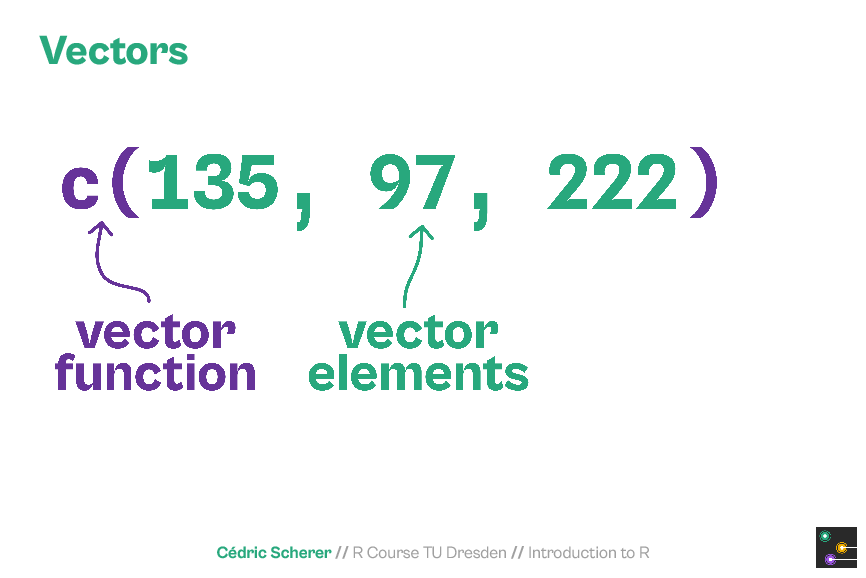
As the #rstats course material is not public (yet?) or available as online training (yet?), I thought I am sharing some slides from the deck.
The course covers all steps of the #DataScience workflow as featured in @hadleywickham's fantastic #R4DS 📕 r4ds.had.co.nz/index.html


The course covers all steps of the #DataScience workflow as featured in @hadleywickham's fantastic #R4DS 📕 r4ds.had.co.nz/index.html


How should you 𝐥𝐞𝐚𝐫𝐧 𝐏𝐨𝐰𝐞𝐫 𝐁𝐈? 🚀
🧵
🧵
It's easy to be overwhelmed by how broad #PowerBI is😖
If you're starting out, here's the path I recommend⏬
If you're starting out, here's the path I recommend⏬
📊 𝐃𝐚𝐭𝐚 𝐌𝐨𝐝𝐞𝐥𝐢𝐧𝐠
Begin by learning to organize data into tables, create relationships, and add calculated columns and measures.
This is the most important part of your journey, as understanding the #data is always the first step in Power BI development.
Begin by learning to organize data into tables, create relationships, and add calculated columns and measures.
This is the most important part of your journey, as understanding the #data is always the first step in Power BI development.
▶️Practice Writing SQL Queries using Real
Dataset 💯
🧵
Dataset 💯
🧵
“The very first thing, we must do when writing #SQL queries, is to understand the underlying data. Once we understand the data and how this data is stored across different tables, it becomes much simpler to write SQL #Queries to retrieve any information from that data”
✅List of SQL Queries:
We shall write SQL #Queries using this data. For each of these queries, you would find the problem statement and then the screen shot of the expected output. Under each of these 20 problem statement
We shall write SQL #Queries using this data. For each of these queries, you would find the problem statement and then the screen shot of the expected output. Under each of these 20 problem statement
Untuk edisi #rabuTableau minggu ini, gue mau bahas soal data preparation atau persiapan data. Meski beberapa bagian di thread ini spesifik untuk digunakan untuk Tableau, namun banyak poin yg bermaanfaat untuk analisis data juga kok.
Mari kita belajar ngolah data! 📊
Mari kita belajar ngolah data! 📊

Biar lebih paham, sebelum berkutat ke tools @tableau atau @tableaupublic , gue mau sharing dulu apa itu data preparation.
Lo bisa simak gimana prinsip-prinsip mengolah data supaya bisa digunakan dengan layak nantinya.
Lo bisa simak gimana prinsip-prinsip mengolah data supaya bisa digunakan dengan layak nantinya.
Analisis Film Indonesia rilis di bioskop di 2022 sudah bisa dibaca di thread ini.
Simak beberapa poin menarik berdasarkan data dengan variabel rating IMDB, Letterboxd, penjualan tiket, dst.
Simak ya 🎬!
Bisa juga dibaca di medium: medium.com/data-science-i…
Simak beberapa poin menarik berdasarkan data dengan variabel rating IMDB, Letterboxd, penjualan tiket, dst.
Simak ya 🎬!
Bisa juga dibaca di medium: medium.com/data-science-i…

Data ini sendiri diambil tepat tanggal 1 Januari 2023 agar bisa dapetin gambaran variabel selama 2022. Untuk rating penilaian film dari Letterboxd dan IMDB, untuk rilis atau PH dari Wikipedia, dan untuk penjualan tiket dari aplikasi @cinepoint_ . 

Tahun 2022 memang luar biasa untuk film Indonesia. Film terlaris di tahun itu juga jadi film Indonesia terlaris sepanjang masa. Sepanjang 2022, KKN di Desa Penari mencatat angka 9,2 juta. Sekarang sih udah tembus 10 juta.
Di analisis ini kita bisa melihat selain tiket.
Di analisis ini kita bisa melihat selain tiket.
Ready to measure density in your neighborhood? We’re excited to announce the official release of #Residensity, our new site for measuring & exploring residential density & housing type anywhere in MA! Now available to everyone.🏡📊🥳🎉mhp.net/residensity 1/ @KimDriscollMA
First time hearing about #Residensity? It’s a user-friendly map platform for exploring & analyzing housing counts & residential density for any MA location. Visit our landing page for more info. mhp.net/about-us/data/… 2/ @RepAndyVargas @SenJohnFKeenan @LydiaMEdwards
Residensity is for everyone! Use our platform to learn more about your neighborhood or any neighborhood! Get quick & easy insights about neighborhood density, housing types & more! 3/ @MassGIS @lucschuster @jenny_schuetz @landpolicy @BrentToderian @amydain @danalewinter
Hugely important insight here for analysts and data scientists. It isn't enough to know the right answer: you have to persuade people to pay attention to it...
This is a big problem since the group of people who have the insights (the analysts) are often the least effective at persuading decision makers to pay attention and actually make different decisions...
Analysts are often introverts and often focus on the art of analysis (getting the right answer) rather than the much wider job of persuading the people in power to make the right decisions...
What is the most successful Hollywood movie of recent times? Everyone says and thinks Avatar right? But, as ever, it depends how you look at it.
We took a deep data dive and found some surprising, nay *horrifying* answers…(1/18)
We took a deep data dive and found some surprising, nay *horrifying* answers…(1/18)
#Avatar (2010) grossed close to $3bn worldwide, very closely followed by Avengers: Endgame at $2.8bn. Avatar 2 is currently at ~$2bn. While still climbing, it’s doubtful it will beat out its predecessor (2/18) 

Note this steady, beautiful trend of films earning more and more… Might be a sign of rising returns. Or could be a side-effect of our old friend INFLATION 📈 So our first step: inflation adjust the data (3/18)
Chat GPT no solo es un maestro en la generación de texto, también puede hacer mapas impresionantes.
En este hilo les muestro sus habilidades en 9⃣ sencillos pasos para un impacto visual en sus proyectos de datos.
#ChatGPT #datavisualization #maps #DataViz #MakeOverMonday
En este hilo les muestro sus habilidades en 9⃣ sencillos pasos para un impacto visual en sus proyectos de datos.
#ChatGPT #datavisualization #maps #DataViz #MakeOverMonday

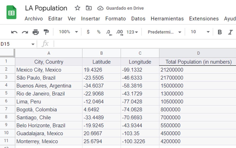
1⃣Damos al Chat GPT el prompt para que genere una tabla con datos de las diez ciudades más pobladas en América Latina, incluyendo su latitud y longitud.
#ChatGPT #PromptSharing #DataViz #LatinAmerica
#ChatGPT #PromptSharing #DataViz #LatinAmerica

2⃣ Exportamos la información a una tabla de Google Sheets y la guardamos en nuestro drive.
💻
#GoogleDrive #ChatGPT
💻
#GoogleDrive #ChatGPT


