Discover and read the best of Twitter Threads about #Viz
Most recents (7)
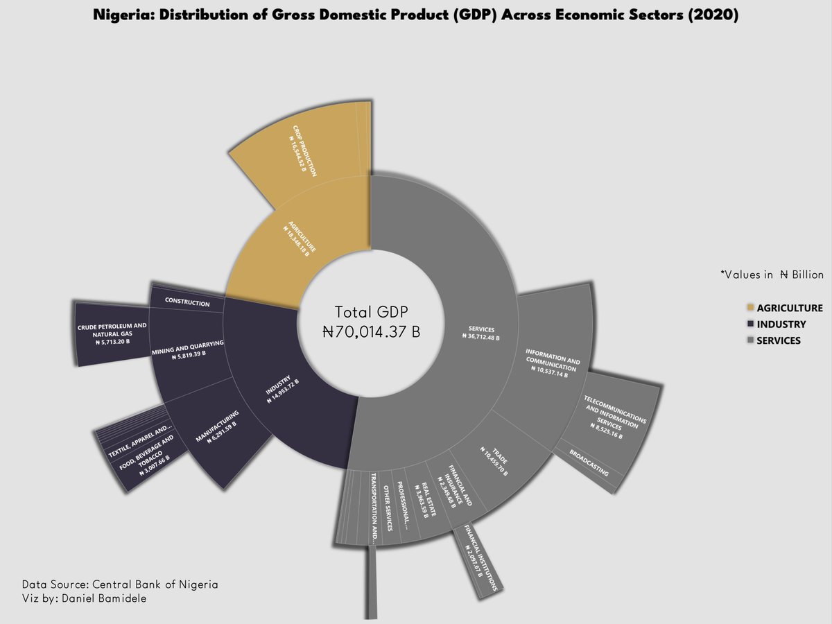
Hi #datafam, here’s a sunburst chart I made using Excel. This #viz shows how each economic sector contributed to Nigeria’s GDP in 2020. Data was obtained from CBN. Here's a thread with instructions on how to create this #viz in Excel.
🧵🧵
🧵🧵

@IbukunOshiga @Talktomissbela @HappyAdejoh @volkaseezn_ @IAGeographer1 @Angiepresh1 @el_victoriaa @_Promise_Nonso @agboolar3 @malcom_okonkwo @saltypip @Bawzz_lady
A Sunburst Chart is made up of an inner circle encircled by rings representing higher degrees of hierarchy. Each segment's angle is proportionate to a value or split evenly under its parent node.
The sunburst chart is best used for presenting hierarchical data.
The sunburst chart is best used for presenting hierarchical data.
Hi #datafam, here’s a radial bar chart I made using Excel. This viz summarizes the top 10 nations by annual nominal minimum wage in USD in 2022. This chart was made using data scraped from a Wikipedia table. Here's a thread with instructions on how to create this #viz in Excel
🧵
🧵

@saltypip @seyiflawless @malcom_okonkwo @JAEmmanuel9 @el_victoriaa @TheApollo47 @Haffiz_Anoze @BolajiO_ @Xionne_ @AndrewAjir @toohodtotrot @Aboki_Esq @fahiemad @FavourFae
Note: You need to have basic knowledge of Excel and making charts in Excel to follow this thread
Making figures for publications is an often neglected stage - and in many situations we resolve to simplest figures made in PowerPoint etc. Aa a #science_designer I'm often commissioned to revamp such figures. Here's an example processes. #sciart #viz thread of 10 

0) It's a figure I'm working on with other colleagues - the initial version (LEFT) was "OK" - it would do in terms of conveying messages (if accompanied with a proper label). MIDDLE = first iteration. RIGHT = close to finish. It still needs some work but:
#30DayMapChallenge
Map 1: Points
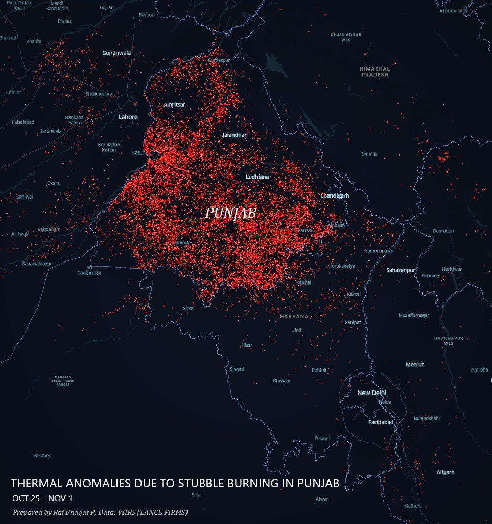
Thermal anomalies observed across Northern India in the last one week. These are primarily stubble-burning crop fire incidents in #Punjab.
Map 1: Points
Thermal anomalies observed across Northern India in the last one week. These are primarily stubble-burning crop fire incidents in #Punjab.

#30DayMapChallenge
Map 2: Lines (Only one line though 😋)
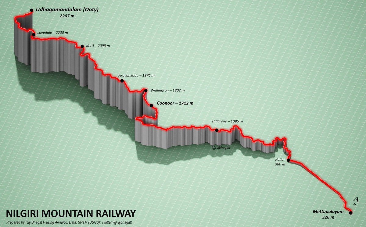
#Viz shows the elevation profile of Nilgiri Mountain Railway in Tamil Nadu which is an UNESCO world heritage site
Map 2: Lines (Only one line though 😋)
#Viz shows the elevation profile of Nilgiri Mountain Railway in Tamil Nadu which is an UNESCO world heritage site

#30DayMapChallenge
Map 3: Polygons
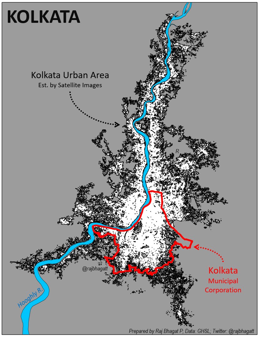
#Map shows 3 Polygon layers for #Kolkata City
1. Municipal corporation -in 🔴
2. Kolkata Urban Area -Satellite est. -in ⬛️
3. Hooghly River -in 🔵
DYK: More than 2/3rds of Kolkata's urban agg population lives outside the Kolkata Corporation?
Map 3: Polygons
#Map shows 3 Polygon layers for #Kolkata City
1. Municipal corporation -in 🔴
2. Kolkata Urban Area -Satellite est. -in ⬛️
3. Hooghly River -in 🔵
DYK: More than 2/3rds of Kolkata's urban agg population lives outside the Kolkata Corporation?

#Viz: Map shows the water divide in India
Surface water flow from rainfall to the left of green line flows into western seas (Arabian etc.) n the right of the green line drains into eastern waterbodies (Bay of Bengal etc.).
Endorheic Basins (that dont drain into sea) not shown
Surface water flow from rainfall to the left of green line flows into western seas (Arabian etc.) n the right of the green line drains into eastern waterbodies (Bay of Bengal etc.).
Endorheic Basins (that dont drain into sea) not shown

Reposting some of the visuals here in this thread if anyone wants to see them in one place :)
Future posts would be added to this...
Future posts would be added to this...


