Discover and read the best of Twitter Threads about #tidyTuesday
Most recents (24)
The best way to learn data analysis is to actually practice it.
Each week, the #tidyTuesday challenge gives you plenty of opportunity for this.
Don't know how to get started with the challenge? In case you missed it, I've put together an #rstats guide in January.
Each week, the #tidyTuesday challenge gives you plenty of opportunity for this.
Don't know how to get started with the challenge? In case you missed it, I've put together an #rstats guide in January.
First, get the data.
Head over to the tidyTuesday's GitHub repo at github.com/rfordatascienc…
Just copy the code from the "Get the data" section.
Head over to the tidyTuesday's GitHub repo at github.com/rfordatascienc…
Just copy the code from the "Get the data" section.

The best way to learn data analysis is to actually practice it.
Each week, the #tidyTuesday challenge gives you plenty of opportunity for this.
Don't know how to get started with the challenge? Here's an #rstats guide using this week's data.
Each week, the #tidyTuesday challenge gives you plenty of opportunity for this.
Don't know how to get started with the challenge? Here's an #rstats guide using this week's data.
First, get the data.
Head over to the tidyTuesday's GitHub repo at github.com/rfordatascienc…
Just copy the code from the "Get the data" section.
Head over to the tidyTuesday's GitHub repo at github.com/rfordatascienc…
Just copy the code from the "Get the data" section.

This week for #TidyTuesday, I explored K12 school run radio stations. I was interested in where these stations are located and what types of music they play. Shout out to my favorite station @c895radio with their dance music in Seattle! 

@c895radio My process:
- Explore the data & determine what questions I can address with a plot
- Filter data for school-associated stations & get geo data
- Plot the US & put dots for each station
- Color stations by simplified music genre groups
- Customize colors, background, etc
- Explore the data & determine what questions I can address with a plot
- Filter data for school-associated stations & get geo data
- Plot the US & put dots for each station
- Color stations by simplified music genre groups
- Customize colors, background, etc
You can see my entire process including live coding, errors, and future directions at:
I have 10+ years of university-level education.
But no lecture taught me how to create good visualizations.
These things are crucial for communication but are often not part of the training.
So, let's have a crash course on visualization guidelines anyone can implement. 🧵
But no lecture taught me how to create good visualizations.
These things are crucial for communication but are often not part of the training.
So, let's have a crash course on visualization guidelines anyone can implement. 🧵
1. Know your audience
You can't use the same visualization for every audience.
A plot that works in a scientific journal may bore (or confuse) non-scientists.
You can't use the same visualization for every audience.
A plot that works in a scientific journal may bore (or confuse) non-scientists.
2. Know your takeaways
Forget the dream of putting ALL of your great insights into one powerful plot.
This. does. not. work.
If anything, this dream is a gateway to using too many chart types all at once.
Visualize only your most important insights (maybe in separate plots).
Forget the dream of putting ALL of your great insights into one powerful plot.
This. does. not. work.
If anything, this dream is a gateway to using too many chart types all at once.
Visualize only your most important insights (maybe in separate plots).
Happy Tuesday! Today I'm going to share a little more about my R journey.
I first learned R through a statistics class and book in college. Then I learned more about it in my second full-time job as a statistician in market research by reading and using another person's code.
I first learned R through a statistics class and book in college. Then I learned more about it in my second full-time job as a statistician in market research by reading and using another person's code.
I got really into doing data viz in R after I joined my local R-Ladies chapter (@RLadiesTucson) in 2020 and started participating in weekly #TidyTuesday sessions.
By practicing my data analysis and visualization weekly in R through #TidyTuesday, I've learned new functions and improved my #RStats skills. It's also super inspiring to see other people's work and explore their code. I really appreciate the openness of the R community!
Hi everyone! I'm Jenn, and I'm super excited to be curating #RLadies this week! I've worked in data/data science for about 10 years, and I love R! I mainly use R for data viz and analysis. (1/5)
This week I'll be talking about #DataViz and learning #RStats. I learned R first in grad school and then on the job when I worked as a statistician. (2/5)
Now, I use R in my work as a research analyst and for data viz projects I do for fun, like participating in #TidyTuesday and visualizing the books I read in 2021. (3/5)
Do you want to learn #RStats, but aren't quite sure where to start?
Myself and some great colleagues from @_bios2 wrote down our best tips for learning R on your own, out today in @PLOSCompBiol 🔓
✨Ten Simple Rules for Teaching Yourself R✨
journals.plos.org/ploscompbiol/a…
🧵:
Myself and some great colleagues from @_bios2 wrote down our best tips for learning R on your own, out today in @PLOSCompBiol 🔓
✨Ten Simple Rules for Teaching Yourself R✨
journals.plos.org/ploscompbiol/a…
🧵:
RULE 1: Prepare for a steep learning curve 📈
#RStats is a language, and as such, won't be picked up in a day. When learning R, remember that progress will be slow and you may have some growing pains. As you get more practice, you'll become better at picking up new techniques.
#RStats is a language, and as such, won't be picked up in a day. When learning R, remember that progress will be slow and you may have some growing pains. As you get more practice, you'll become better at picking up new techniques.

RULE 2: Take the time to read a book 📚
No matter how general or specific an R skill you want to
learn, there is probably a great book on that skill!
One great place to look is the "Books" section on the
@rstudio website:
rstudio.com/resources/book…, but plenty more exist, too!
No matter how general or specific an R skill you want to
learn, there is probably a great book on that skill!
One great place to look is the "Books" section on the
@rstudio website:
rstudio.com/resources/book…, but plenty more exist, too!
This is a🧵🧵 about small steps you can take to learn #dataviz.
It's mainly a collection of things I wish I had known when I started learning. (And it comes with many resources)
It's mainly a collection of things I wish I had known when I started learning. (And it comes with many resources)
I used to get stuck trying to create something "big". But building a dataviz from scratch is waaay too much effort at first.
Learning just 1 new trick, that's doable.
Baby steps. They're not as exciting as a flashy new viz. But they're motivating bite-size chunks of success.
Learning just 1 new trick, that's doable.
Baby steps. They're not as exciting as a flashy new viz. But they're motivating bite-size chunks of success.
1 // Data
First you need data.
Don't overthink what may be exciting or not. Just grab this week's #tidyTuesday data set.
(There are advantages of using TidyTuesday data. I'll come to that next) github.com/rfordatascienc…
First you need data.
Don't overthink what may be exciting or not. Just grab this week's #tidyTuesday data set.
(There are advantages of using TidyTuesday data. I'll come to that next) github.com/rfordatascienc…
First up in the tidymodels track: @hfcfrick talking about censored! #rstudioconf2022 #rstudioconf #rstats 

censored is for survival analysis, which isn't just for Data about death! Example: newspaper demand / how many papers to put into each stand. #rstudioconf2022 #rstudioconf #rstats
parsnip provides consistency for model interfaces. censored extends parsnip for survivorship #rstudioconf2022 #rstudioconf #rstats 

messy, realistic datasets are **extremely** useful for learning, teaching, exploring, and practicing your #rstats skills. so where do you find datasets like this?!
here are some practical tips you can use to find messy datasets! 🧵
here are some practical tips you can use to find messy datasets! 🧵
you may be familiar with the #TidyTuesday project as a fantastic community effort to practice data visualization.
BUT did you know it's an incredible resource for finding datasets on topics ranging from pollution to board games to tech adoption?
github.com/rfordatascienc…
BUT did you know it's an incredible resource for finding datasets on topics ranging from pollution to board games to tech adoption?
github.com/rfordatascienc…
did you know some of the weekly #TidyTuesday dataset contributions actually include cleaning scripts? that means you can practice either on the original/raw data OR the slightly-transformed ready-to-visualize data.
Take a look at SF Rent data for example: github.com/rfordatascienc…
Take a look at SF Rent data for example: github.com/rfordatascienc…
I need to design a London tube map-like visualization... any leads for a- tools b-design approaches?
#TidyTuesday #30DayChartChallenge #dataviz @DataVizSociety
#TidyTuesday #30DayChartChallenge #dataviz @DataVizSociety
Five quick #rstats tips I've picked up in the plots I've made for the first category of the #30DayChartChallenge 🧵👇
1. Need to plot a million points and ggplot() is taking too long but you want to stay within the tidyverse?
👉 Use 📦{scattermore} with geom_scattermore() 🥳
1. Need to plot a million points and ggplot() is taking too long but you want to stay within the tidyverse?
👉 Use 📦{scattermore} with geom_scattermore() 🥳
Another year of #TidyTuesday now complete! 🎉Here is a collage of all the participants with more than 10 posts over 2021. Big thanks to @thomas_mock for leading the initiative🙌
Interactive version: kaustavsen.github.io/tidytuesday-co…
#RStats #d3js #dataviz
1/3
Interactive version: kaustavsen.github.io/tidytuesday-co…
#RStats #d3js #dataviz
1/3
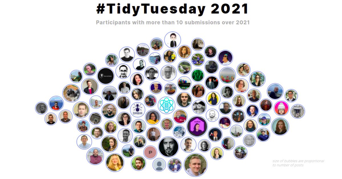
It was really fun participating and also browsing through the amazing charts by y'all.
Initial data cleaning for the collage done in R with final plot created with d3.js
All code on github here: github.com/kaustavSen/tid…
2/3
Initial data cleaning for the collage done in R with final plot created with d3.js
All code on github here: github.com/kaustavSen/tid…
2/3
Finally look forward to more plotting come 2022! (Hopefully will continue my R+d3 learning journey in the coming year 😅).
Also, do let me know in case of any comments / suggestions on how to improve this collage. Will definitely look to incorporate into the 2022 version!
3/3
Also, do let me know in case of any comments / suggestions on how to improve this collage. Will definitely look to incorporate into the 2022 version!
3/3
📊🧵 Collection of tweets featuring open-access materials that I have shared over the last years:
Talks, seminars, blog posts, hands-on notebooks, codes, and more!
#rstats #ggplot2 #tidyverse #dataviz 🧙♂️


Talks, seminars, blog posts, hands-on notebooks, codes, and more!
#rstats #ggplot2 #tidyverse #dataviz 🧙♂️


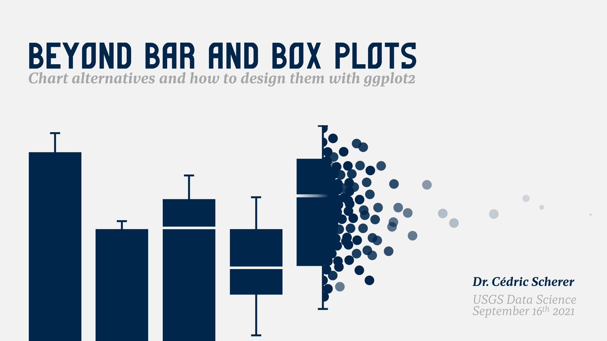
"Evolution of a #ggplot2" — blog post
@ParkerKMathias I haven't had the chance to look at the data yet, so these ideas might not be directly applicable, but I'd say that there are at least three ways to approach this, depending on the scope and "error tolerance" of the analysis:
@ParkerKMathias (1) using tidyr::separate() to split a list of authors and then pivot_longer() to count them separately
You could split
|Song 1 | Mariah Carey and So-and-so |
into
|Song 1 | Mariah Carey | So-and-so |
then pivot_longer into
|Song 1 | Mariah Carey |
|Song 1 | So-and-so |
You could split
|Song 1 | Mariah Carey and So-and-so |
into
|Song 1 | Mariah Carey | So-and-so |
then pivot_longer into
|Song 1 | Mariah Carey |
|Song 1 | So-and-so |
@ParkerKMathias (1) but this would fail in many cases, e.g. where the artists are separated differently, e.g. "Mariah Carey & So-and-so". Also, you have to specify the number of columns to separate into, so if you have more than two artists only the first pair would be separated:
#JSM2021 panel led by @minebocek on upskilling for a statistician -- how to learn??
@minebocek #JSM2021 @hglanz no shortage of stuff to learn. First identify what you don't know -- that comes from modern media (blogs, twitter, podcasts; groups, communities -- @RLadiesGlobal or local chapters; professional organizations -- @amstatnews ).
@minebocek @hglanz @RLadiesGlobal @AmstatNews #JSM2021 @hglanz What do the job postings require these days? (This is how the content for the @CalPoly stat/data science program was developed.)
i'm diving into #rstats 💫tidymodels💫-the framework is incredibly powerful 💪, but there is a lot to learn! 🗻here are some resources i have found helpful (thank you developers and content creators!!)- please comment if you have others to add as well! 🙏
2019 A gentle introduction to tidy models by @theotheredgar rviews.rstudio.com/2019/06/19/a-g…
rstudio::conf(2020) Introduction to Machine Learning with the Tidyverse by @apreshill & @StatGarrett education.rstudio.com/blog/2020/02/c…
New blog post up for #rstats ggplot custom 💫interactive💫 sunbursts!
🍰create some layers w/ geom_rect()
🔄 rotate w/ coord_polar()
🪄 sprinkle in some {ggiraph} for hover over interactivity 😎
demo data w/ #TidyTuesday salary survey
pipinghotdata.com/posts/2021-06-…
🍰create some layers w/ geom_rect()
🔄 rotate w/ coord_polar()
🪄 sprinkle in some {ggiraph} for hover over interactivity 😎
demo data w/ #TidyTuesday salary survey
pipinghotdata.com/posts/2021-06-…
1⃣ interactive sunburst w/ variable length
2⃣ interactive sunburst w/ fixed length
Neste semestre, a @BeaMilz e o @jtrecenti ministraram a primeira turma do curso de Relatórios e Visualização de dados. Os trabalhos finais ficaram muito legais, e 3 foram premiados com uma bolsa de estudos em qualquer curso! Segue o 🧶:
#RStats #ggplot2 #TidyTuesday
#RStats #ggplot2 #TidyTuesday
Em ordem alfabética, o primeiro trabalho é da Ariane Hayana @arianehayana!
O trabalho foi um #TidyTuesday com dados sobre consumo de alimentos e emissões de CO2.
🖥️ Leia o trabalho em: curso-r.github.io/202103-visuali…
#rstats #ggplot2 #dataviz #DataScience
O trabalho foi um #TidyTuesday com dados sobre consumo de alimentos e emissões de CO2.
🖥️ Leia o trabalho em: curso-r.github.io/202103-visuali…
#rstats #ggplot2 #dataviz #DataScience

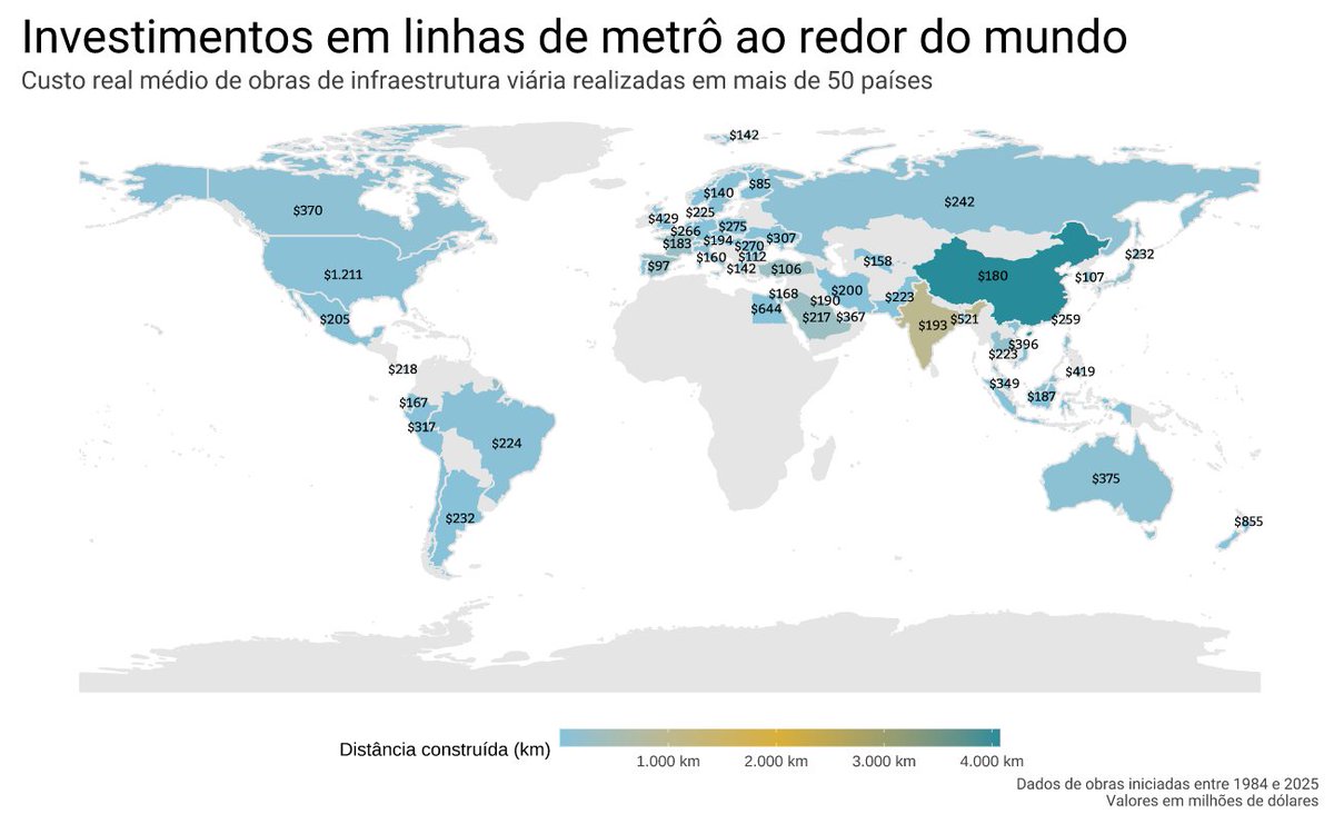
O trabalho da Brunna Escouto @brunnace foi um #TidyTuesday com dados relativos ao custo de obras de infraestrutura de trânsito, em especial metrôs, com informações de 54 países.
🖥️ Leia o trabalho em: curso-r.github.io/202103-visuali…
#rstats #ggplot2 #dataviz #DataScience #xaringan
🖥️ Leia o trabalho em: curso-r.github.io/202103-visuali…
#rstats #ggplot2 #dataviz #DataScience #xaringan
#TidyTuesday Week 2020/32 ⚡ European Electricity by @EU_Eurostat inspired by @JohnMuyskens, @karim_douieb & @robradburn
Still experimenting with geofacets 🌐 And still experimenting with moon charts 🌘🌒🌖 Not enough green on that chart though.
#r4ds #rstats #ggplot2 #dataviz
Still experimenting with geofacets 🌐 And still experimenting with moon charts 🌘🌒🌖 Not enough green on that chart though.
#r4ds #rstats #ggplot2 #dataviz
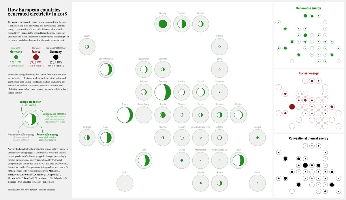
Wasn't sure if I like the grey or white version better.
#FridaysForFuture #ClimateCrisis #ClimateAction #ClimateChange
#FridaysForFuture #ClimateCrisis #ClimateAction #ClimateChange
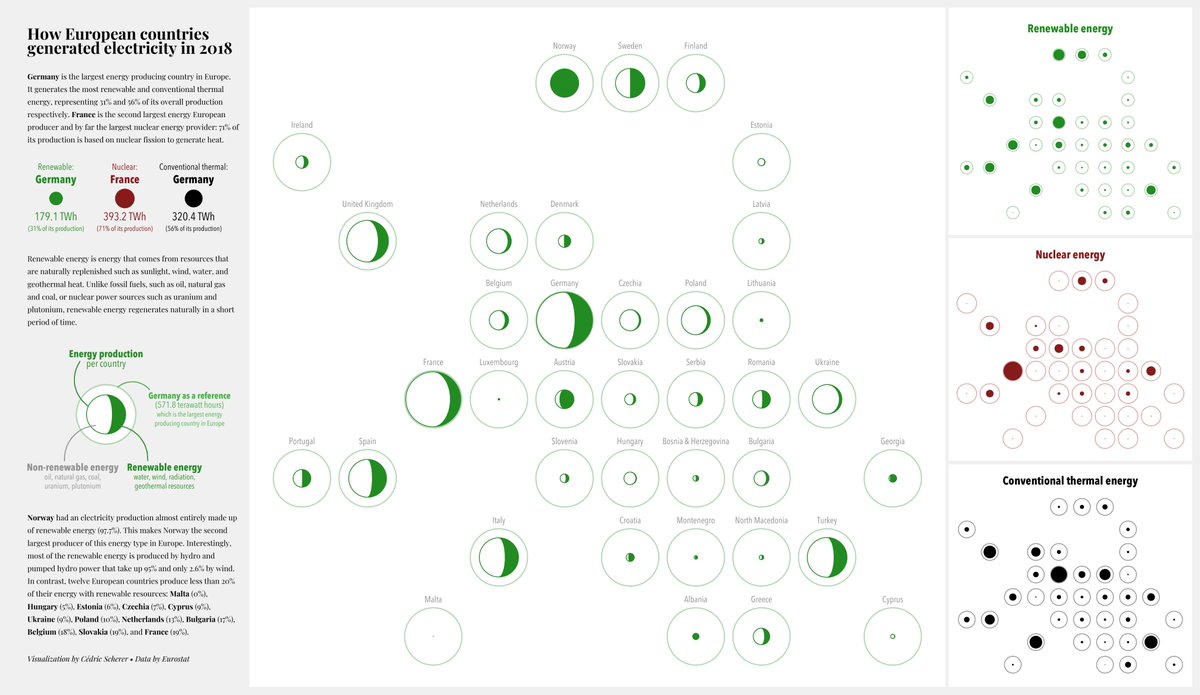
Code for this and many other #dataviz'es on my GitHub: github.com/Z3tt
Just like to say, for anyone learning stats/coding at uni & hating it, I tried to drop my course bc I found it so difficult & frustrating and now, 3yrs later, I just got excited when I found out about an online event each week where you analyse data & share your code, for fun. 🤓
It’s called #TidyTuesday if anyone wants to join me!!! github.com/rfordatascienc…
.@emercurial_, my college roommate, can confirm the number of times they woke up in the morning and I was still laid out on the sofa staring at r studio wondering wtf all these words mean and writing notes to myself like # this didn’t work # neither did this # screw everything
Experiencing major data viz block and would love some help.
Anyone have ideas for how I might creatively display this data on economic mobility using #rstats? Thanks!
Data: bit.ly/32tncMM
Report it will go in: tfff.org/obtn/
Anyone have ideas for how I might creatively display this data on economic mobility using #rstats? Thanks!
Data: bit.ly/32tncMM
Report it will go in: tfff.org/obtn/
Pinging some folks who always post amazing data viz as part of #TidyTuesday: @CedScherer, @geokaramanis, @jakekaupp
@KTorresStats Hi Katy!
The resume looks good to me!
I'm starting a thread with some ideas.
Goal 1: Connect with #rstats data science community
- Tons of academic and industry here on Twitter
- do informational interviews with acquaintances
- join @RLadiesGlobal Slack @R4DScommunity
The resume looks good to me!
I'm starting a thread with some ideas.
Goal 1: Connect with #rstats data science community
- Tons of academic and industry here on Twitter
- do informational interviews with acquaintances
- join @RLadiesGlobal Slack @R4DScommunity
@KTorresStats @RLadiesGlobal @R4DScommunity Goal here is to meet someone who can get your name to a hiring manager
- referrals == stronger chance of interview/hire
- R4DS and #rladies Slack are places outside Twitter to find job posts, ask questions, network
- Info interviews help you understand what pro DS do/expect
- referrals == stronger chance of interview/hire
- R4DS and #rladies Slack are places outside Twitter to find job posts, ask questions, network
- Info interviews help you understand what pro DS do/expect
@KTorresStats @RLadiesGlobal @R4DScommunity Goal #2: read livebook.manning.com/book/build-you…
By @robinson_es and @skyetetra
Tons of good ideas and biggest additional step IMO == get a public portfolio
Essentially show the industry that you can do the job already!
By @robinson_es and @skyetetra
Tons of good ideas and biggest additional step IMO == get a public portfolio
Essentially show the industry that you can do the job already!


