Discover and read the best of Twitter Threads about #ggplot2
Most recents (24)
If you're starting out in data science (or if your wondering what you need to learn), don't believe everything you read. 🧵
Spot BS and focus on these 4 steps to grow your career.
#datascience #rstats #career
Spot BS and focus on these 4 steps to grow your career.
#datascience #rstats #career

My friend Rafael Nicolas Fermin Cota (Nico) pointed me to this modified graphic from a Harvard Business Review Article on "Prioritizing Which Data Science Skills Your Company Needs".
With ChatGPT, AI, and the "trendiness" of buzzwords, this graphic becomes even more dangerous. hbr.org/2018/10/priori…
1/ 🌟 R's Hidden Gems: Lesser-Known Functions and Packages You Need to Know! 🎉 Discover powerful functions and packages that can help you become an R power user. Let's dive in and learn together! #rstats #AdvancedR #DataScience 

2/ 🧙♂️ Functions: R has many built-in functions that often go unnoticed. Here are a few:
•with(): Apply expressions to a data frame without using the $ operator
•switch(): Simplify conditional expressions
•do.call(): Call a function with arguments in a list
•with(): Apply expressions to a data frame without using the $ operator
•switch(): Simplify conditional expressions
•do.call(): Call a function with arguments in a list
3/ 📦 janitor: Clean and preprocess your data with ease. Functions like clean_names() and remove_empty() make your data tidier and more manageable. Say goodbye to messy data frames! #rstats #datascience
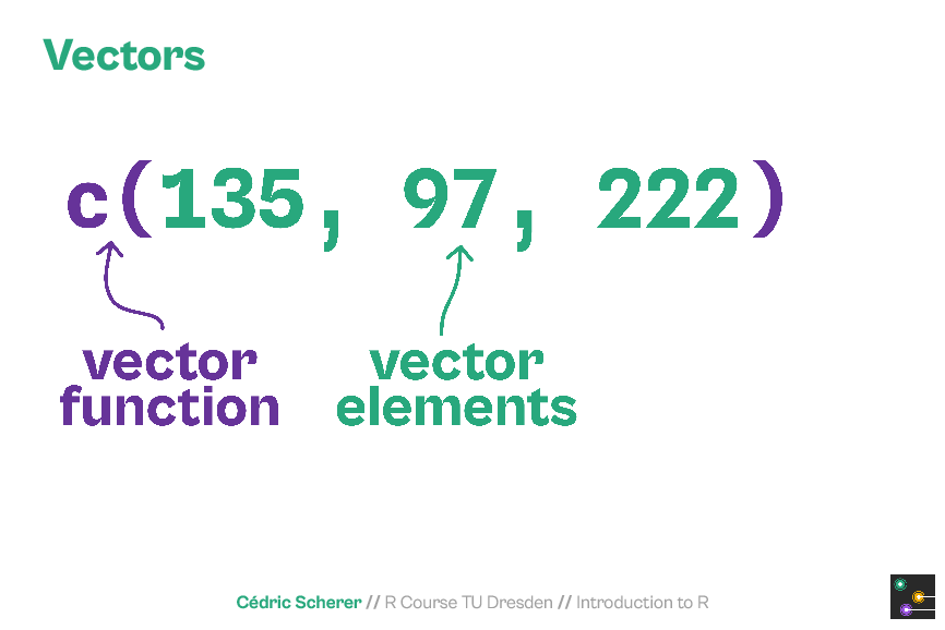
As the #rstats course material is not public (yet?) or available as online training (yet?), I thought I am sharing some slides from the deck.
The course covers all steps of the #DataScience workflow as featured in @hadleywickham's fantastic #R4DS 📕 r4ds.had.co.nz/index.html


The course covers all steps of the #DataScience workflow as featured in @hadleywickham's fantastic #R4DS 📕 r4ds.had.co.nz/index.html


🌎 ¡Acabo de encontrar una serie de mapas increíbles realizados con #RStats! Desde mapas interactivos hasta diseños 3D, hay algo para todos los amantes de los datos espaciales
👇 ¡8 cuentas a las que definitivamente vale la pena darle un vistazo!🧵
#dataviz #maps #geospatial #gis
👇 ¡8 cuentas a las que definitivamente vale la pena darle un vistazo!🧵
#dataviz #maps #geospatial #gis
✅ Tyler Morgan-Wall @tylermorganwall
🔗 buff.ly/3ZBWNKe
Mapa 3D giratorio con puntos de luz (mapa anterior)
🔗 buff.ly/3QDfXLx
La red de cable submarino de fibra óptica de la Tierra.
Utiliza #rayshader #rayrender #rayverse
#dataviz #maps #geospatial #gis
🔗 buff.ly/3ZBWNKe
Mapa 3D giratorio con puntos de luz (mapa anterior)
🔗 buff.ly/3QDfXLx
La red de cable submarino de fibra óptica de la Tierra.
Utiliza #rayshader #rayrender #rayverse
#dataviz #maps #geospatial #gis
@tylermorganwall ✅ Milos Popovic @milos_agathon
🔗 buff.ly/3CJM6LN
Mapa % de empleados en la fabricación, datos Eurostat.
#dataviz #maps #geospatial #gis #rstats #DataVisualization #stats #DataScience
🔗 buff.ly/3CJM6LN
Mapa % de empleados en la fabricación, datos Eurostat.
#dataviz #maps #geospatial #gis #rstats #DataVisualization #stats #DataScience

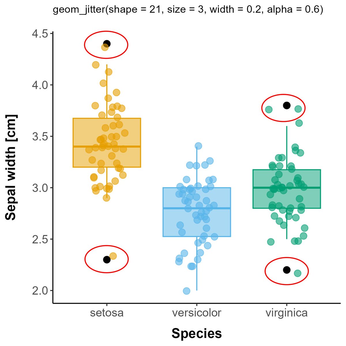
Organised another workshop on #DataViz in R using #ggplot2 within our Forest Entomology group at @WSL_research. Managed to cover most of the basics, looking forward to the "Advanced DataViz with ggplot2" workshop next week! A few issues / special cases we discussed today: 1/n 


Are you interested in getting started in #bioinformatics but not sure where to begin? Here are some tips to help you get started on your journey. A THREAD🧵🧵:
Start by learning a high-level #programming language, such as #Python or #R, and familiarizing yourself with data structures and #algorithms commonly used in #bioinformatics. The #BioPython and #Bioconductor libraries are great resources for this.
(1/n) A fun and practical idea for an R package: a #ggplot2 extension to modify plots so they adhere to an organization’s visual identity 📊📈📉⬇️
(2/n) A visual identity allows an entity to be instantly recognized. Made up of their logo, typography, and colors, it can be applied when creating external or internal communications. For example, here’s the visual building blocks of my alma mater @UBC: bit.ly/3EN0oNs 

@UBC (3/n) My first crack at package development was during my master's studies with @UBCMDS. My classmates and I created a #ggplot2 extension to allow users to change the appearance of plots based on the visual identities of different Canadian universities: bit.ly/3VHssIe
(1/n) I love telling stories with data and I have recently discovered #gganimate as a way to take my #dataviz to the next level.
gganimate.com
gganimate.com
Here is some sample code to generate a random walk, create a line plot, and layer in the animation. I love how it's simple to layer within the #ggplot2 framework. 
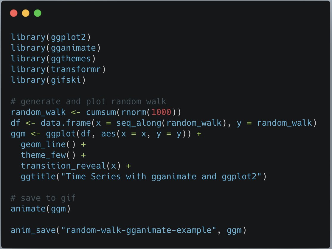
(3/n) Here is the resulting plot! using the `transition_reveal()` it keeps the previous points on the graph, but it is highly configurable. For example, I could use `transition_time()` or `transition_state()` to only show the point being added.
👩🏼💻 How do you set up your own #ShinyApp?
It's easy in #rstats! Start a new #Rproject and select "Shiny Application". It will create a project with an "app.R" file for you ✨
It's easy in #rstats! Start a new #Rproject and select "Shiny Application". It will create a project with an "app.R" file for you ✨

Once it's open, you can replace the code that is already in the "app.R" file with this code snippet below👇 It does all the magic and shows how you can build a simple #ShinyApp 🔮
(it's here for you to try: bit.ly/shinyapp-test)

(it's here for you to try: bit.ly/shinyapp-test)


What the ShinyApp does:
You have checkboxes on the left side that let you choose countries (it's the ISO3 abbreviation, so "RWA" stands for Rwanda) and, depending on what you selected, your #ShinyApp will show a (non-realistic) population size for each country in a new plot.
You have checkboxes on the left side that let you choose countries (it's the ISO3 abbreviation, so "RWA" stands for Rwanda) and, depending on what you selected, your #ShinyApp will show a (non-realistic) population size for each country in a new plot.
Hello everyone 👋 my name is Cosima and I usually tweet at @cosima_meyer.
In my professional life, I work as a data scientist in the field of AI. I love my job because it allows me to work with fantastic teams to solve puzzles👩🏼💻
In my professional life, I work as a data scientist in the field of AI. I love my job because it allows me to work with fantastic teams to solve puzzles👩🏼💻

@cosima_meyer Before working in the industry, I explored my passion for research in academia. I hold a PhD from the University of Mannheim in #politicalscience (my dissertation dealt with post-civil war stability 🕊).
@cosima_meyer While working at @MZESUniMannheim, I co-founded a #datascience blog “Methods Bites” (@mzes_ssdl) which provides several hands-on tutorials on #NLP, scraping #Twitter data, #dataviz, or how to publish your package on #CRAN.
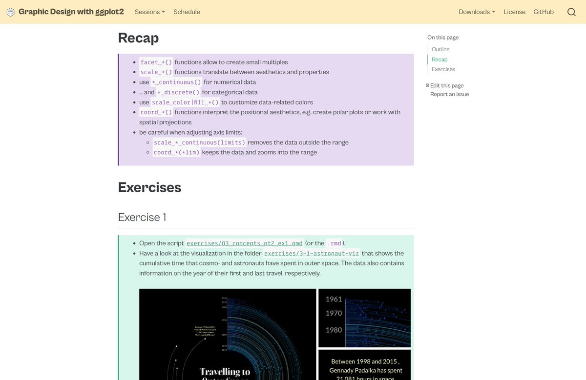
"Graphic Design with #ggplot2" 👨💼👩💻🧑💻
Do you want to recap the 2-day workshop at #rstudioconf? Or do you feel sad you've missed it?
🔥 All course material incl. latest updates can be found on the workshop webpage—9 sessions, 760 slides, 314 ggplots!
👉 rstudio-conf-2022.github.io/ggplot2-graphi…


Do you want to recap the 2-day workshop at #rstudioconf? Or do you feel sad you've missed it?
🔥 All course material incl. latest updates can be found on the workshop webpage—9 sessions, 760 slides, 314 ggplots!
👉 rstudio-conf-2022.github.io/ggplot2-graphi…


@rstudio The session pages contain not only the slides but
🔵 hands-on #rstats codes
🔵 recap notes
🔵 exercises incl.
🔵 prepared scripts, either as #quarto or #rmarkdown
🔵 step-by-step solutions
➕ all source codes on GitHub:


🔵 hands-on #rstats codes
🔵 recap notes
🔵 exercises incl.
🔵 prepared scripts, either as #quarto or #rmarkdown
🔵 step-by-step solutions
➕ all source codes on GitHub:


Forget regular heat maps. Use bubbles on a grid instead 🔵 🟢 🤯
A short #dataviz thread 🧵 🧵
#rstats #ggplot2
1/8
A short #dataviz thread 🧵 🧵
#rstats #ggplot2
1/8

Regular heat maps have the crucial flaw of not showing how much samples were used. 🤔
That's totally fine when the different sizes are shown (e.g. with colors). It's what I did with my calendar plot a while back (special heat map)
2/8
That's totally fine when the different sizes are shown (e.g. with colors). It's what I did with my calendar plot a while back (special heat map)
2/8
We've been exploring the new #T2T human genome assembly compared to previous versions (our news and views article is out today, link below). Some observations:
(1) Its pretty amazing what the human genome project was able to do in 2004: large-scale gene order is totally conserved
(1) Its pretty amazing what the human genome project was able to do in 2004: large-scale gene order is totally conserved

(2) Some of the chromosomes are nearly identical between the 2013 GRCh38 assembly and T2T. For example, here is a zoom in on Chr10 - just a few gaps in the pericentromere that were filled in with tandem repeats in T2T. 

(3) But other chromosomes have been dramatically improved. For example, here are Chr9 and acrocentric Chr14.
Plot legend: sliding window proportion of sequence in genes (dark orange = exons) and repeats (light blue = #repeatMasker, dark blue = #trf); red segments = GRCh38 gaps.
Plot legend: sliding window proportion of sequence in genes (dark orange = exons) and repeats (light blue = #repeatMasker, dark blue = #trf); red segments = GRCh38 gaps.

From standard output to powerful storytelling.
Here's how you can recreate the storytelling with data look in #ggplot2.
A detailed thread 🧵⬇️
#rstats #dataviz

Here's how you can recreate the storytelling with data look in #ggplot2.
A detailed thread 🧵⬇️
#rstats #dataviz
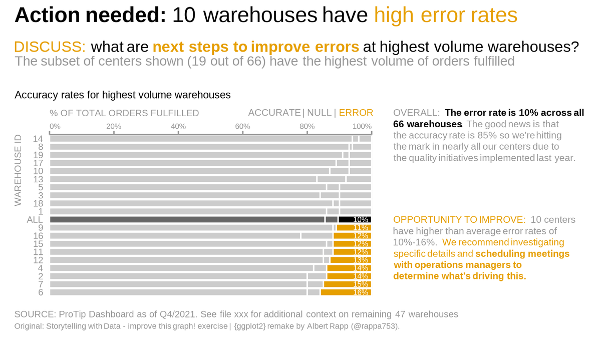
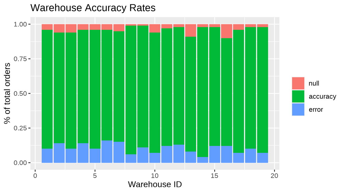
This thread is based on my newest blog post. Find it at albert-rapp.de/post/2022-03-2…
There, you will find more details and ressources than I can offer in this thread.
The blog post was inspired by a makeover video by storytelling with data. You can find it at
There, you will find more details and ressources than I can offer in this thread.
The blog post was inspired by a makeover video by storytelling with data. You can find it at
@waitbutwhy uses powerful visuals to illustrate his ideas.
One visual stuck in my head. And I think the message is so important that it cannot be said often enough.
So, I practiced recreating the visual with #ggplot2.
🧵w/ original and ressources⬇️ #rstats #dataviz
One visual stuck in my head. And I think the message is so important that it cannot be said often enough.
So, I practiced recreating the visual with #ggplot2.
🧵w/ original and ressources⬇️ #rstats #dataviz
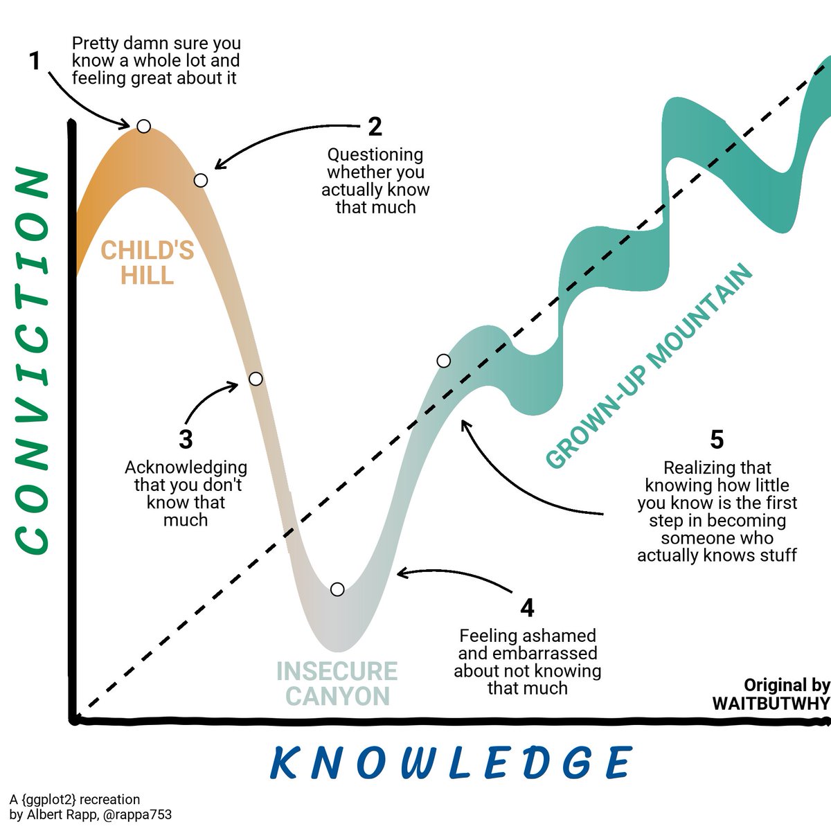
Here is the orginal tweet (check out his other tweets too if you get a chance).
I like to think that I came close to the original but the stick men were too tricky. Also, it turns out that the original uses its own font that I could not replicate.
I like to think that I came close to the original but the stick men were too tricky. Also, it turns out that the original uses its own font that I could not replicate.
For this visual, I used Bézier curves. I could try to explain them but I am not qualified to that, I think.
Rather, check out this visually pleasing video from @FreyaHolmer. It gives you a quick and beautiful rundown.
Rather, check out this visually pleasing video from @FreyaHolmer. It gives you a quick and beautiful rundown.
@dr_allancameron and I are thrilled that the #rstats package {geomtextpath}, a #ggplot2 extension, that we've been rearing over the past few months has landed on CRAN 📢! We loved that there was engagement during development, so a few of our favourites in the 🧵⬇️ 

Allan and I both answer ggplot2 questions on SO a bit, so it was no coincidence that we were intrigued by the same question that sparked the package
stackoverflow.com/q/69867669/113…
stackoverflow.com/q/69867669/113…
Early on when we just got it working in principle, there was already a blogpost out that put us *on the right path*:
🌟Publication alert!🌟
Botanists are discovering several endemic plants in the Indian savannas—ecosystems long misinterpreted as wastelands of low conservation value.
Article link (DM for access if needed): onlinelibrary.wiley.com/doi/10.1111/bt…
Read on for a summary. 1/n
Botanists are discovering several endemic plants in the Indian savannas—ecosystems long misinterpreted as wastelands of low conservation value.
Article link (DM for access if needed): onlinelibrary.wiley.com/doi/10.1111/bt…
Read on for a summary. 1/n
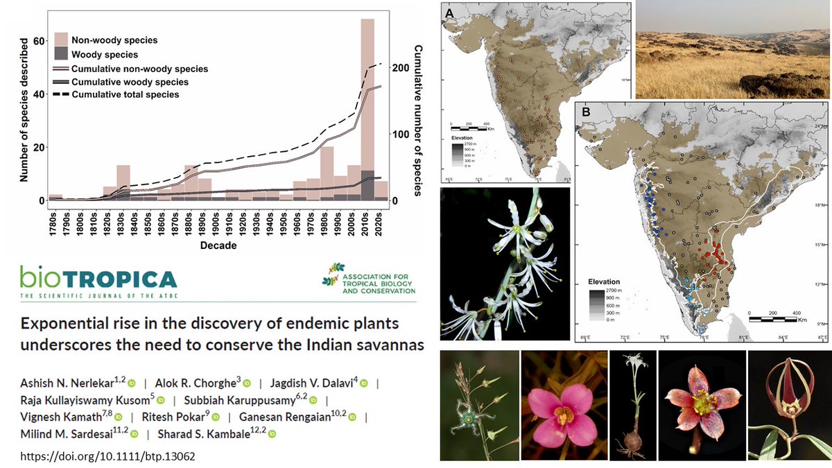
A huge proportion of biodiversity remains undescribed globally, and this biodiversity knowledge shortfall is disproportionately > for tropical savannas compared to tropical forests 2/n
Some of this is coz tropical savannas have been misinterpreted as secondary ecosystems having negligible endemics. Eg. Malagasy savannas were once thought to be t most degraded landscapes on earth with no endemics. Recent studies now show tht 40% of Malagasy grasses r endemic 3/n
🔥 THREAD: global fire patterns 🔥
Recent drought-related #wildfires have underscored how #climate change can increase fire risks regionally.
But various factors (e.g. human ignitions/suppression, vegetation growth) control fire, making regional fire patterns horribly complex!
Recent drought-related #wildfires have underscored how #climate change can increase fire risks regionally.
But various factors (e.g. human ignitions/suppression, vegetation growth) control fire, making regional fire patterns horribly complex!
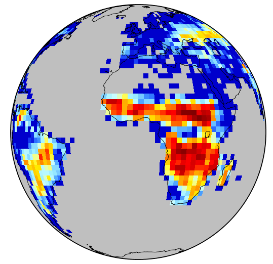
It's tough to distill all these complexities into general statements, so here's a thread to showcase what 🛰 observations can reveal about 🔥 trends at various regional scales.
I invite you to get lost in the maps that follow and appreciate the complexity in all its glory! 🤘
I invite you to get lost in the maps that follow and appreciate the complexity in all its glory! 🤘
📊🧵 Collection of tweets featuring open-access materials that I have shared over the last years:
Talks, seminars, blog posts, hands-on notebooks, codes, and more!
#rstats #ggplot2 #tidyverse #dataviz 🧙♂️


Talks, seminars, blog posts, hands-on notebooks, codes, and more!
#rstats #ggplot2 #tidyverse #dataviz 🧙♂️


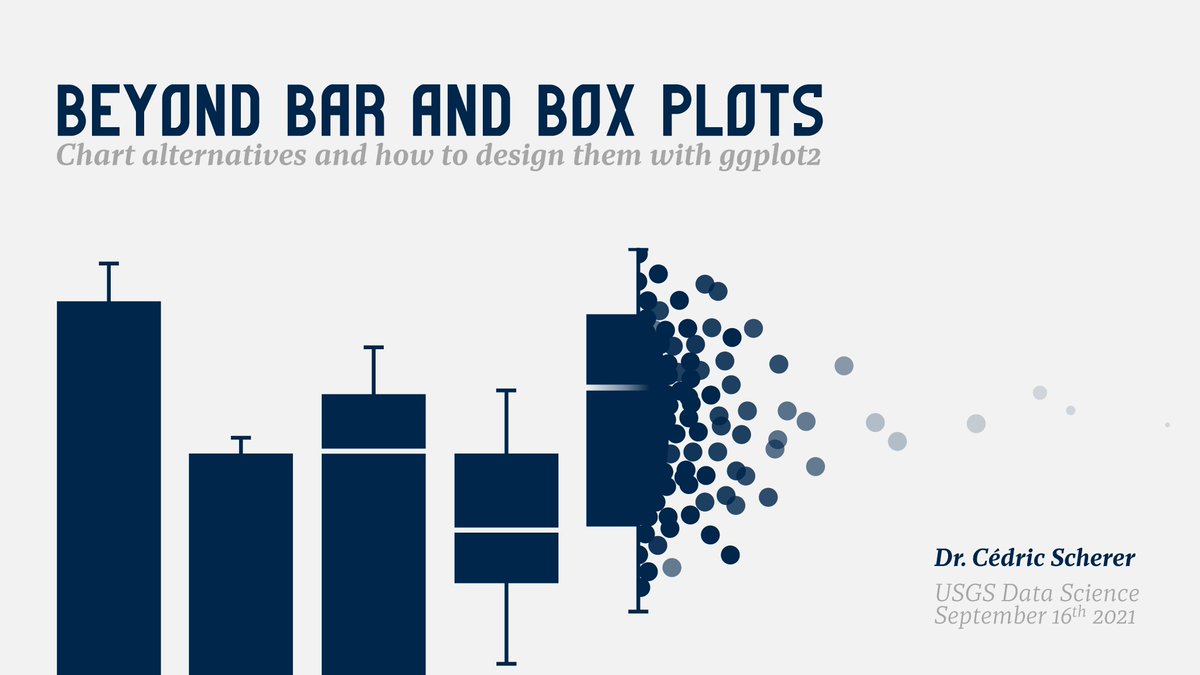
"Evolution of a #ggplot2" — blog post
1/5 One more example by @CedScherer showing how to add proper labels on a line chart:
R: r-graph-gallery.com/web-line-chart…
Python: python-graph-gallery.com/web-line-chart…
R: r-graph-gallery.com/web-line-chart…
Python: python-graph-gallery.com/web-line-chart…

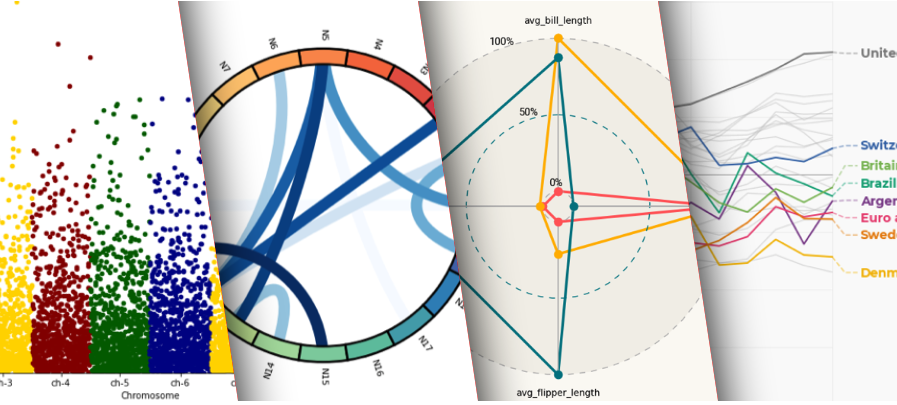
2/5 One more example by @alextuowang: a good looking radar chart:
R: r-graph-gallery.com/web-radar-char…
Python: python-graph-gallery.com/web-radar-char…
btw, I know radar chart are criticised:
data-to-viz.com/caveat/spider.…
R: r-graph-gallery.com/web-radar-char…
Python: python-graph-gallery.com/web-radar-char…
btw, I know radar chart are criticised:
data-to-viz.com/caveat/spider.…

I bet you haven't read very many studies on restoring Indian #grasslands. Read on for a summary of our recent article in @SERestoration s flagship journal: onlinelibrary.wiley.com/doi/10.1111/re…
#restoration #dryland #invasive #India #biodiversity #Gujarat #GenerationRestoration #Prosopis 1/n
#restoration #dryland #invasive #India #biodiversity #Gujarat #GenerationRestoration #Prosopis 1/n

When we think of restoration, we often think of planting trees. While adding trees might be useful for restoring (some) forests, restoring grasslands often need tree-removal. Encroaching trees on grasslands, like t #invasive Prosopis juliflora in India, are a restortn challng 2/n 

Understanding how to best manage encroaching woody plants in biodiverse #tropical grasslands is critical for sustaining biodiversity and people. 3/n
Neste semestre, a @BeaMilz e o @jtrecenti ministraram a primeira turma do curso de Relatórios e Visualização de dados. Os trabalhos finais ficaram muito legais, e 3 foram premiados com uma bolsa de estudos em qualquer curso! Segue o 🧶:
#RStats #ggplot2 #TidyTuesday
#RStats #ggplot2 #TidyTuesday
Em ordem alfabética, o primeiro trabalho é da Ariane Hayana @arianehayana!
O trabalho foi um #TidyTuesday com dados sobre consumo de alimentos e emissões de CO2.
🖥️ Leia o trabalho em: curso-r.github.io/202103-visuali…
#rstats #ggplot2 #dataviz #DataScience
O trabalho foi um #TidyTuesday com dados sobre consumo de alimentos e emissões de CO2.
🖥️ Leia o trabalho em: curso-r.github.io/202103-visuali…
#rstats #ggplot2 #dataviz #DataScience

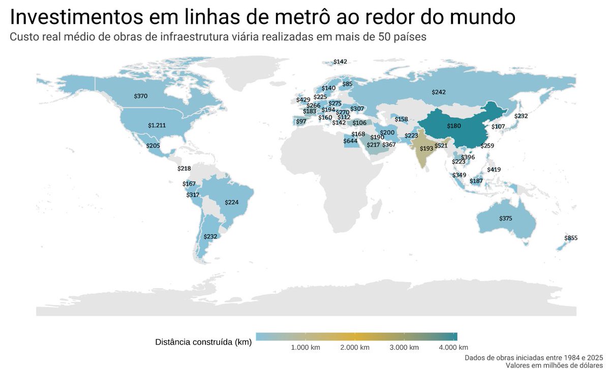
O trabalho da Brunna Escouto @brunnace foi um #TidyTuesday com dados relativos ao custo de obras de infraestrutura de trânsito, em especial metrôs, com informações de 54 países.
🖥️ Leia o trabalho em: curso-r.github.io/202103-visuali…
#rstats #ggplot2 #dataviz #DataScience #xaringan
🖥️ Leia o trabalho em: curso-r.github.io/202103-visuali…
#rstats #ggplot2 #dataviz #DataScience #xaringan
(1/12) Announcing R CHARTS, the new #rstats and #rstatsES #dataviz site which includes, per language:
📈 Over 1100 #ggplot2 and base R charts
🧑🏫 Over 120 tutorials
📊 Over 50 different chart types
🎨 Several color & palette tools
r-charts.com
Made with #blogdown 🤩
📈 Over 1100 #ggplot2 and base R charts
🧑🏫 Over 120 tutorials
📊 Over 50 different chart types
🎨 Several color & palette tools
r-charts.com
Made with #blogdown 🤩
(2/12) The site contains 8 different categories (the Spatial section is under construction) based on the Financial Times Visual Vocabulary:
raw.githubusercontent.com/ft-interactive…
raw.githubusercontent.com/ft-interactive…

(3/12) Once you pick a category you will see all the available #rstats charts for that category.
You can filter them by their chart type and base R or #ggplot2.
r-charts.com/correlation/
You can filter them by their chart type and base R or #ggplot2.
r-charts.com/correlation/


