Discover and read the best of Twitter Threads about #typography
Most recents (16)
Repainted advertisement for tea of De Vries.
amsterdamtypography.nl/item/1491
#Amsterdam #Typography #TypeInAmsterdam
amsterdamtypography.nl/item/1491
#Amsterdam #Typography #TypeInAmsterdam

The company of De Vries was active from the 1920s until 1980. More on the website of @OnsAmsterdam (in Dutch): onsamsterdam.nl/muurvlakte-te-…
This sign was covered by a small billboard for many years, that's probably why it was still legible in 1986, as you can see on this photo: archief.amsterdam/beeldbank/deta…
#generating #letters with code. Introduction to ◷Radius ◱Scale, ▱Skew, ⤲Couple. #Symbolfont #SYFF #Concept. (Orbital Dyn. reveal later, needs more work) #typography #font #lowercase 

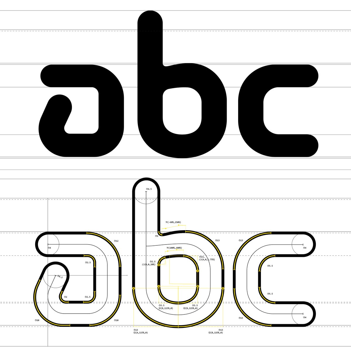
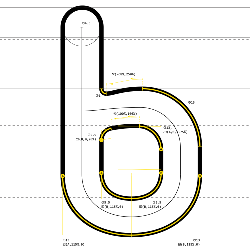
#generating #letters with code. Here are two "o" letters, one is more squared than the other, an additional function was needed ⟏ Constraint (ANC, HZN, VRT), that limits the anchor movement during ▱Skew. We will use the first variant of the letter. 

Continuing with the font design, here's e,f,g
#algorithmic #typography #font
The #open_eye "e" with straight finial,
the letter "f" also featuring a straight terminal with a #raised_ear.
With the most boring "g". We might look into an alternative for that.

#algorithmic #typography #font
The #open_eye "e" with straight finial,
the letter "f" also featuring a straight terminal with a #raised_ear.
With the most boring "g". We might look into an alternative for that.


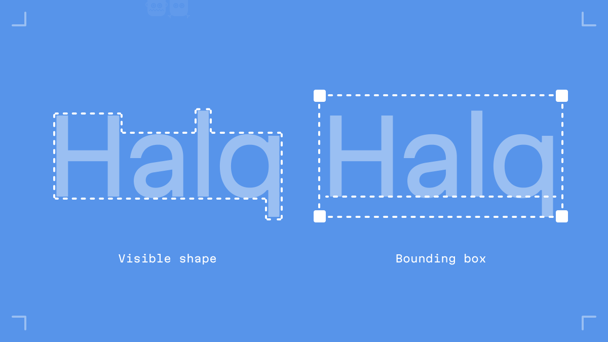
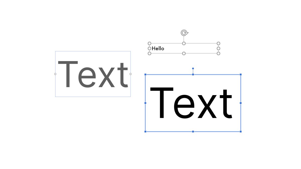
The vertical metrics of the Martian Grotesk and Mono typeface family are one reason they work great in UIs.
In this thread, I explain how “equal” metrics—metrics that lead to equal space above and below the text—can make digital design and development easier.
#uiux #typography
In this thread, I explain how “equal” metrics—metrics that lead to equal space above and below the text—can make digital design and development easier.
#uiux #typography

Roboto Flex by @fontbureau is here!
After 5 years of intensive development, its huge range of weights and widths across a complete stack of optical sizes is ready for you to use in all kinds of products and documents.
material.io/blog/roboto-fl…
🧵
After 5 years of intensive development, its huge range of weights and widths across a complete stack of optical sizes is ready for you to use in all kinds of products and documents.
material.io/blog/roboto-fl…
🧵

For this release, we’ve added a little more knowledge to our site about what makes Roboto Flex truly special—a big new idea in type and #variablefonts: Parametric Axes.
fonts.google.com/knowledge/glos…
fonts.google.com/knowledge/glos…
Want to geek out on parametric axes? Watch @dberlow discussing what they are and how he came up with the idea. @Atypl
GRAPHIC DESIGNING FOR BEGINNERS:
HOW YOU CAN BE BETTER AT CHOOSING FONTS. (FREE RESOURCES) 📝✨
- a thread 🧵
HOW YOU CAN BE BETTER AT CHOOSING FONTS. (FREE RESOURCES) 📝✨
- a thread 🧵
📌 | Typography plays a crucial role in design. That’s why selecting an appropriate font is a necessary step for the success of a design.
📍 | It can be a bit tricky. However, under this thread I will share many tried-and-trusted principles that you should keep in mind to make a good font choice.
GRAPHIC DESIGNING FOR BEGINNERS:
HOW TO HELP BUSINESSES ATTRACT CUSTOMERS WITH DESIGNS. (FREE RESOURCES) 💼📈
- a thread 🧵
HOW TO HELP BUSINESSES ATTRACT CUSTOMERS WITH DESIGNS. (FREE RESOURCES) 💼📈
- a thread 🧵
📌 | Audience's attention & sales is crucial to a business. A Graphic Designer's job is to make something attractive (to target audience) so that it helps achieving the business' overall goal of making more money.
📍 | The truth is, by making some seemingly small changes, you can drastically improve a business' sales & direct their audience. So in this thread, I have gathered psychologically & scientifically-proven ways that can help YOU attract audience.
GRAPHIC DESIGNING FOR BEGINNERS:
10 MUST HAVE FONTS FOR PROFESSIONAL DESIGNS! (FREE, SANS SERIF) 📝✨
- a thread 🧵
10 MUST HAVE FONTS FOR PROFESSIONAL DESIGNS! (FREE, SANS SERIF) 📝✨
- a thread 🧵
📌 | Finding the best free fonts can be tricky for most of us, especially if you're working for a commercial project.
📍 | So to make it easy for you, I have gathered fonts that professional designers would want you to use, & that would go well with your design projects.
LA monogram on a former building of Lettergieterij Amsterdam (Amsterdam Type Foundy) from 1912.
#Amsterdam #Typography #TypeInAmsterdam
#Amsterdam #Typography #TypeInAmsterdam

More about this building on the website of @RonaldKlip (in Dutch): 020apps.nl/kaart/1850-194…
More about the typefaces of this type *foundry on @FontsInUse: fontsinuse.com/foundry/238/am…
Steel bricks forming minimalist letters that spell "forever".
#Amsterdam #Typography #TypeInAmsterdam
#Amsterdam #Typography #TypeInAmsterdam

The letters are part of the artwork Forever in Stone (2008) by Martijn Sandberg. You can find more of his work on msandberg.nl.
Previously featured letters from this artwork:
C'est publié! Our aim in preparing *Forms and Formats and the Circulation of Knowledge* was to take the discussion of formats into the busy world of business transactions, copyrights, economic constraints, and the hustle and bustle of the #printshop (brill.com/view/title/579…)
Here is a look at the TOC - these contributors were a dream to work with: James Raven, Jeffrey Hopes, Rebecca Schoff Curtin, @ijalexander2002 , Yvonne Cornish, @katieparker18th, @cgspence, James P. Ascher, @Jacqui_R_Walsh, David Duff - and co-editor Louisiane Ferlier ! 


Hello tweeps!
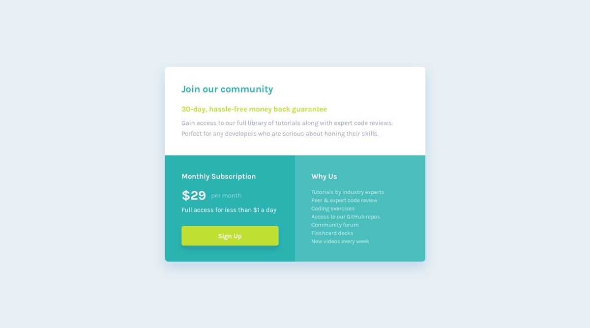
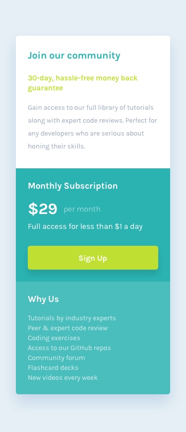
In this #Thread, I'll be explaining step-by-step process of designing the below #UI #Mockup (by @frontendmentor) with only #html & #css.
You can follow along by typing out the #codes in the images.
#100DaysOfCode #CodeNewbie
#WomenWhoCode #freeCodeCamp
1/25

In this #Thread, I'll be explaining step-by-step process of designing the below #UI #Mockup (by @frontendmentor) with only #html & #css.
You can follow along by typing out the #codes in the images.
#100DaysOfCode #CodeNewbie
#WomenWhoCode #freeCodeCamp
1/25
2/25
We'll learn how to look at mockups so we can do the following:
1. Deduce #html tags to #code the #webpage
2. Declare #css properties to style the webpage
3. Establish #breakpoints to make the webpage #responsive.
.
.
First, let's set up our html page.
#webdev
We'll learn how to look at mockups so we can do the following:
1. Deduce #html tags to #code the #webpage
2. Declare #css properties to style the webpage
3. Establish #breakpoints to make the webpage #responsive.
.
.
First, let's set up our html page.
#webdev
3/25
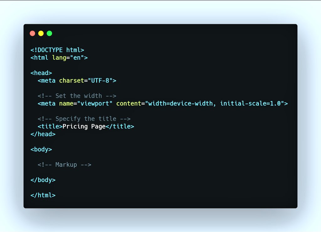
As shown below, we started with the following:
1. Create an #html document.
2. Specify the title.
3. Set the width.
The width is set to equal the viewport width. This means that it'll be as wide as the screen viewing the page - first step to #responsive #designs!
As shown below, we started with the following:
1. Create an #html document.
2. Specify the title.
3. Set the width.
The width is set to equal the viewport width. This means that it'll be as wide as the screen viewing the page - first step to #responsive #designs!
With just over a month left in 2020, let’s talk about the #designtrends we expect to see in 2020. I’ve noticed, and this is usually the case, a larger focus on animation this last year. Flat, #material animation especially 2D characters. Also there has been an increased
Social media focus on “lesson” #Instagram style posts with multiple screens. Hell I tried it myself to see how I would go about doing it. The good thing about these types of posts is that they actually do contain some good info, but I think the trend has hit its peak now.
Next year, I suspect the design world will get more into simple #motiongraphics, perhaps even the multi-screen style static pages we have seen but shorter, more focused animated style typography based animations as the tech becomes more widely available through phones and tablets
Between 1960 and 1970 Penguin Books underwent several revolutions in cover layout, at a time when public tastes were rapidly changing. For today's #TuesdayThoughts I look back at 10 years that shook the Penguin.
This is the story of the art of the #book cover...
This is the story of the art of the #book cover...
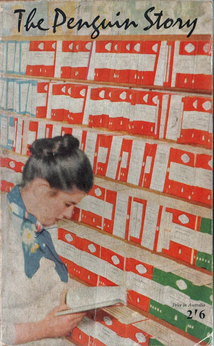
Allen Lane founded Penguin Books in 1935, aiming to bring high-quality paperbacks to the masses for the same price as a packet of cigarettes. Lane began by snapping up publishing rights for inexpensive mid-market novels and packaging them expertly for #booklovers. 

So here’s your comic building package for 2019!
A fully updated list of (~65) comic publisher submission guidelines. #comics #comicbooks #makecomics
jasonthibault.com/definitive-lis…
A fully updated list of (~65) comic publisher submission guidelines. #comics #comicbooks #makecomics
jasonthibault.com/definitive-lis…
An overview of the entire (give or take) comic/GN/manga publishing universe. #comics #comicbooks #makecomics
jasonthibault.com/comic-publishe…
jasonthibault.com/comic-publishe…
Here’s 45 books to get you on your way. Creatives in any field can get something out of the craft of comic making. It’s all words and pictures folks! #comics #comicbooks #makecomics
jasonthibault.com/books-for-comi…
jasonthibault.com/books-for-comi…
