Discover and read the best of Twitter Threads about #designtwitter
Most recents (24)
Color is probably the trickiest thing to master, especially using code. I wrote a thread breaking down color models and how to manipulate color in @p5xjs 🧵 1/n 

There are several color models out there, you're probably already familiar with RGB - Red, Green, Blue. Each color is represented by three values ranging between 0 - 255 (256 Possibilities). 

The problem with RGB is that it is meant to be machine-readable, your brain doesn't intuitively know why 212,24,118 is the color it is. It's meant to control the pixels on the screen and doesn't translate well to other uses, especially in making art.
Learn how to create a ɴᴇᴏɴ ɢʟᴀꜱꜱ effect using @sketch ✨
How far can we take this tweet? 👀 Let's retweet and see how it goes 🚀
#MadeWithSketch #glass #NeonArt #effect #icon #design #designtwitter #uidesign #tutorial #Tips
How far can we take this tweet? 👀 Let's retweet and see how it goes 🚀
#MadeWithSketch #glass #NeonArt #effect #icon #design #designtwitter #uidesign #tutorial #Tips
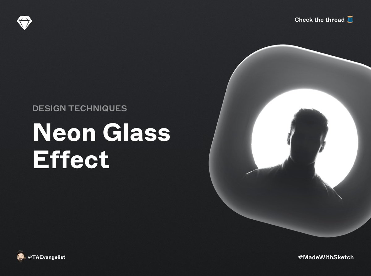
@sketch Create a 200x200 rectangle and give it a corner radius of 65. 

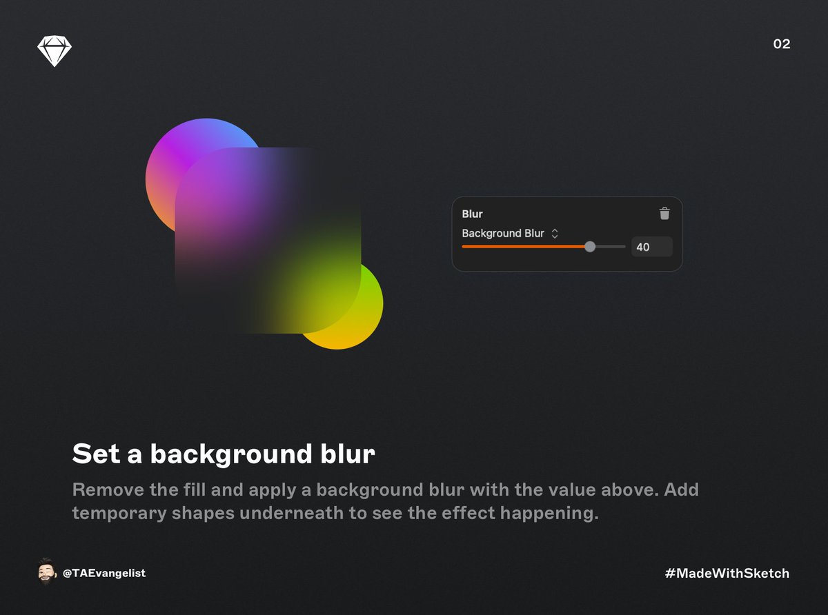
@sketch Remove the fill and apply a background blur 
The greatest branding error: Ignoring Color Psychology
Your brand colors are a way to show who you are & what you do. If you look at the colors of any brand, you'll start to see how they're subconsciously trying to make their brand better
#brandsofnewindia #designtwitter
1/7👇
Your brand colors are a way to show who you are & what you do. If you look at the colors of any brand, you'll start to see how they're subconsciously trying to make their brand better
#brandsofnewindia #designtwitter
1/7👇
It's important to remember that color is the first thing people notice when they visit your site. If they like it, they may keep engaging with you. If they don't like it, you might lose them in a matter of seconds.
2/7
2/7
Color psychology can be used to increase sales, calm crowds, or make athletes work harder.
According to a case study, customers of well-known brands like McDonald's, Coca-Cola, Godrej, and Bank of Baroda were quick to accept some colour changes while rejecting others.
3/7
According to a case study, customers of well-known brands like McDonald's, Coca-Cola, Godrej, and Bank of Baroda were quick to accept some colour changes while rejecting others.
3/7
Had a tweet that got moderately popular among the #designtwitter crew yesterday. Not a huge number of replies in thread but it kicked off dozens of DMs, 90% of which were asking the same question:
What's the biggest unsolved problem in crypto UX?
My answer?
What's the biggest unsolved problem in crypto UX?
My answer?
Wallets. 100%.
Wallet UX is a clusterfuck of recovery phrases, seeds, public/private keys, addresses, and chains — words that aren't words to anyone outside of the crypto world.
(Good luck deciphering them as an average person considering we can barely get them right)
Wallet UX is a clusterfuck of recovery phrases, seeds, public/private keys, addresses, and chains — words that aren't words to anyone outside of the crypto world.
(Good luck deciphering them as an average person considering we can barely get them right)
The mental labor needed to understand even these most basic concepts is on par with relearning calculus. Finding ways to make them accessible makes people like me resort to crimes against art like this in an attempt to get them across
How to improve the mobile input experience of your digital product - A thread
Data input on mobile and desktop is substantially different.
Therefore, applying the same principles will lead to a catastrophic failure.
This is how we improve mobile user input experience:
Data input on mobile and desktop is substantially different.
Therefore, applying the same principles will lead to a catastrophic failure.
This is how we improve mobile user input experience:
1. Minimize data requirement
It is a lot more comfortable to input data on a desktop than on mobile.
Thus, the best thing you can do for improving the mobile input experience, is minimizing the amount of data required.
It is a lot more comfortable to input data on a desktop than on mobile.
Thus, the best thing you can do for improving the mobile input experience, is minimizing the amount of data required.
2. Defaults over custom input
If you know that 80% of your customers are from the US, 15% from the UK and 5% from the rest of the world, it makes sense that the US and UK be the default/top options when it comes to selecting a location.
If you know that 80% of your customers are from the US, 15% from the UK and 5% from the rest of the world, it makes sense that the US and UK be the default/top options when it comes to selecting a location.
How to create effective user personas - A thread
User personas are key to #UX.
They help you answer one of the most important questions in #design - “Who are we designing for?”
Here’s how to start creating user personas that will help you make relatable designs:
User personas are key to #UX.
They help you answer one of the most important questions in #design - “Who are we designing for?”
Here’s how to start creating user personas that will help you make relatable designs:
1. Collate all existent information
The first step is to start collecting everything you know about your users in one place - it might be in a spreadsheet, a doc file, a whiteboard, an affinity diagram - whatever suits you best.
The first step is to start collecting everything you know about your users in one place - it might be in a spreadsheet, a doc file, a whiteboard, an affinity diagram - whatever suits you best.
2. Research and listen
Find your way to directly interact with the users of the software.
If time and the budget do not allow then at least track the Internet footprints of the target audience and listen to what they say.
Find your way to directly interact with the users of the software.
If time and the budget do not allow then at least track the Internet footprints of the target audience and listen to what they say.
As a small business owner, have you always wondered what it takes to make beautiful designs? 🤔
Our designer Anshul Patria (@Razorpay_Design) has the answer for you! ✨🚀
#DesignTwitter #designthinking
Our designer Anshul Patria (@Razorpay_Design) has the answer for you! ✨🚀
#DesignTwitter #designthinking

Canva @canva remains a favourite with its endless template options! 😌 
Humaaans by @pablostanley offers a library of mix-&-match illustrations of people! 🖌️ 

Design Thinking 💡💬
#DesignThinking? Nah!!
We call it ‘Outside the Box’ Thinking 😉 But Why?
A Thread 🧵
#DesignThinking? Nah!!
We call it ‘Outside the Box’ Thinking 😉 But Why?
A Thread 🧵

It is usually mentioned as ‘outside the box’ thinking, as designers try to develop new ways of thinking that don’t abide by the dominant or additional common problem-solving ways.
Instead of getting stuck into the square process of thinking, studying & working, try out your new venture by implementing #Designthinking today itself.
The Design Sprint 🚀
Special mention @jakek @Jicecream @AJSmartDesign 🙌
A Thread 🧵
Who has not gone from the phase where we searched for the solutions to big problems that arrived in our designs and surpassed them to get the desired outcomes?
#DesignSprint #uxdesign #Remote
Special mention @jakek @Jicecream @AJSmartDesign 🙌
A Thread 🧵
Who has not gone from the phase where we searched for the solutions to big problems that arrived in our designs and surpassed them to get the desired outcomes?
#DesignSprint #uxdesign #Remote

Obviously, All of us!! Right? You are like, “what do you think of us? 🙌 talking again about some polemic talks.”
But! But! But! Nothing is our fault; we were surfing here & there and got this very nervy but at the same time exceptionally convincible notion which hits directly to our thoughts & steers to words of today’s thread.
It’ll either be an Efficient Failure or a Flawed Success.
It’ll either be an Efficient Failure or a Flawed Success.
Psychology in Design 🧠
A basic thread 🧵
YES, YES, We know what you are thinking, Psychology? Really? That’s what we bring for the first time a threaded story. Duh! But you never know which psychology we use behind coming up with this. Fascinating? Isn’t it?
#designtwitter
A basic thread 🧵
YES, YES, We know what you are thinking, Psychology? Really? That’s what we bring for the first time a threaded story. Duh! But you never know which psychology we use behind coming up with this. Fascinating? Isn’t it?
#designtwitter

Design isn't solely what you & your customers see. It conjointly concerns what they feel & that is what inspires them to create a procurement. The association between design & psychology will subtly influence your audience and increase your sales.
#Psychology #productdesign
#Psychology #productdesign
There’s an exact method your customers follow while reading your web site. If you observe the way they read your content and using that strategically design around it — you'll be able to encourage further interactions (and ultimately, additional sales).
#Customer #Webdesign
#Customer #Webdesign
Hey, I am looking for someone to help me with a project at the intersection of gaming, art, and disability advocacy/research. I've been hesitant to ask because we don't have a budget, but if you're in school & need a project for credit, I was a Prof. & can help u make that work.
If you know ppl interested in the intersection of gaming, design, and disability research, pls tag them. If you don't, pls retweet! If u are such a person, reply & let me know a bit about your bg/interests. #gaming #design #designtwitter #advocacy #DisabilityTwitter
Huge thanks to everyone who responded so far! Some additional details:
Tracked-out and expanded San Serifs atop a field of wavy lines...
—an homage to the title sequence for the docudrama 'Worm Wood' wherein in 1953 the CIA drugs and kills Frank Olson one of their top scientists?
#designtwitter who wants to tell them?
—an homage to the title sequence for the docudrama 'Worm Wood' wherein in 1953 the CIA drugs and kills Frank Olson one of their top scientists?
#designtwitter who wants to tell them?

Also, @grillitype are you ok with the CIA using your fonts like this? You have provided typefaces to so many laudable nonprofit campaigns and efforts but to see GT Sectra and GT America Extended used in this manner is a fucking gut punch.
#designtwitter
#designtwitter

In honor of being hunted on 🐱 @ProductHunt today by @felix12777, we wanted to highlight what we have learned on our #nocode journey.
It has been 104 days from product signup (@AdaloHQ) to Product Hunt, so here are 104 learnings:
👇
It has been 104 days from product signup (@AdaloHQ) to Product Hunt, so here are 104 learnings:
👇
1) To start, we had to figure out as a non-technical team how to build a technical product to lower the cost of #career navigation 
2) We started Lloyd before the pandemic was the reality it is today, but what has happened in the last year made us even more committed to building a lower cost, quality product. #Nocode was a fast way to keeping costs down to also benefit others
🎯Monthly hiring thread🎯
Oct '20
If you know of any open opportunities, do tag us 🙌
👉 Learn: learnpmwith.me
👉 Network: GrabChai.online
👉 Grow: theproductfolks.com
Here we go, RTs appreciated 🚀
#prodmgmt
Oct '20
If you know of any open opportunities, do tag us 🙌
👉 Learn: learnpmwith.me
👉 Network: GrabChai.online
👉 Grow: theproductfolks.com
Here we go, RTs appreciated 🚀
#prodmgmt
0/ Bunch of open opportunities on our Sept '20 thread 🚀
1/ An early stage fintech start-up is looking for a PM with 2 – 4 years of work experience ideally. They are working alongside a successful entrepreneur on his next big idea.
Apply : rb.gy/j9nal2
Details : rb.gy/ckoz2c
#prodmgmt #productmanagement
Apply : rb.gy/j9nal2
Details : rb.gy/ckoz2c
#prodmgmt #productmanagement
Good microcopy is one of the fastest ways to improve an interface.
Try doing an audit on your UI with these tips to see how it stands up. 👇
Try doing an audit on your UI with these tips to see how it stands up. 👇

(1/4) Guess what? @SekaiFarai @albanvillamil and I are launching HmntyCntrd, an online course & community on 9/27 designed to help UXers do the personal work required to do our best professional work🔥👊🏾Registration opens 7/31, sign up to stay in the loop! bit.ly/stayintheloop_… 

(2/4) HmntyCntrd is hosted on a private, ad-free platform where UXers who desire to rise above the cliches and jargon of our industry can come together & grow in a supportive community. Read: this is not #designtwitter (yeah, we're excited about that too🥳)
👇🏾The 6 week course:
👇🏾The 6 week course:
(3/4)
1-Community Core Principles
2-Barriers & Resistances to Cultural Humility & Competencies
3-The (Mis)Application of Empathy
4-The Impact of Identity, Privilege & Power in Design
5-The New Challenges of Ethical Research & Design
6-The Unspoken Hardships of the UX Professional
1-Community Core Principles
2-Barriers & Resistances to Cultural Humility & Competencies
3-The (Mis)Application of Empathy
4-The Impact of Identity, Privilege & Power in Design
5-The New Challenges of Ethical Research & Design
6-The Unspoken Hardships of the UX Professional
Thread about working on a single product for too long :
1. You get to know the product in and out totally. you will know what features are on the roadmap, what can be improved, what will work for the future, what wont, etc.
1. You get to know the product in and out totally. you will know what features are on the roadmap, what can be improved, what will work for the future, what wont, etc.
But, any random person outside of the product circle will 'definitely' have an out of the box idea that you've never thought of. keep your ears open.
2. you know all the design styles, you maintain a perfect style guide, you stick to the rules for all new features.
2. you know all the design styles, you maintain a perfect style guide, you stick to the rules for all new features.
But, rules are meant to be broken. Make sure your design system evolves with the product. Any design system for sure will get outdated over a period. Keep updating it.
3. Every design you do, will 'suit/fit' the existing layouts and screen. Nothing looks new.
3. Every design you do, will 'suit/fit' the existing layouts and screen. Nothing looks new.
Dear #UX Community, tomorrow is Monday. From your tentative tweeting, it seems like many of you have finally discovered that anti-Black racism is alive and well in America. Don't know what to do? Want to move beyond the hashtag activism? A thread
1. Call out your asshole friends
1. Call out your asshole friends
2. Don't know any assholes? Doubt it in this industry but if not call out your "all lives matter" friends. Call out your "apolitical" friends. "Neutrality" is racism. Silence is racism. Start the conversation on and offline.
3. Don't know how to articulate what you're currently feeling? Read, absorb, and share the work of others:
“...and then, I have nature and art and poetry, and if that is not enough, what is enough?” - #VincentVanGogh I had boarded this @AirIndia flight 2 years back.Have never seen a more beautifully #painted plane before!Have you?It’s gotpart of a #miniaturepainting on its tail wing. 


Found it so fascinating that I kept staring up at it. Felt I was part of this scene from centuries back, literally flying back into time. I’m told it’s a page from a1700 #malwa painting.Why shud technology be inside a museum, why cannot art be on it @MuseumWeek @airindiain 


This is a well-known chair. Never heard it described this way. Perhaps the art vs. design divide begins here.
"This totally sensational, revolutionary chair. Its the deconstruction of an armchair.. this marks the end of comfort" - Rolf Fehlbaum
#chairtimes #desigmtw
"This totally sensational, revolutionary chair. Its the deconstruction of an armchair.. this marks the end of comfort" - Rolf Fehlbaum
#chairtimes #desigmtw

During the '30s depression Rietveld made "crate furniture" reusing slats from crates, selling them as DIY kits.
Was this the 1st packaged DIY furniture? (hi @IKEA).
Ironically you can buy them now for $1000.
rietveldoriginals.com/en/portfolio/c… #designmtw #chairtimes #designtwitter
Was this the 1st packaged DIY furniture? (hi @IKEA).
Ironically you can buy them now for $1000.
rietveldoriginals.com/en/portfolio/c… #designmtw #chairtimes #designtwitter

In true DIY fashion, plans for making these crate chairs are online.
instructables.com/id/Gerrit-Riet… #chairtimes
instructables.com/id/Gerrit-Riet… #chairtimes

@markjohnsoncc @espiekermann @rnkeller @vllg I am not sure where to begin. This has grown beyond a simple back and forth.
I think a list is great but unless it describes something beyond just "places to license type" then it isn't as useful as it *could* be.
I think a list is great but unless it describes something beyond just "places to license type" then it isn't as useful as it *could* be.
@markjohnsoncc @espiekermann @rnkeller @vllg This could be a list with useful filters which might allow people to drill down to a smaller group of foundries.
There are SO MANY great foundries. The problem is not a lot of great typefaces from which we can choose.
There are SO MANY great foundries. The problem is not a lot of great typefaces from which we can choose.
@markjohnsoncc @espiekermann @rnkeller @vllg I really do not want to get into a heated discussion, nor do I wish to anger people whom I consider friends. But, the list should be complete. Then the designers can decide if they want to work with an independent foundry or otherwise. This all being dependent upon their needs.
Let's share a few tips on using Slack!
Here's a thread with some smaller useful ideas that you can borrow or refine... and: add yours! 😁
#slack #etiquette #designtwitter
Thread ↓
Here's a thread with some smaller useful ideas that you can borrow or refine... and: add yours! 😁
#slack #etiquette #designtwitter
Thread ↓
It only took two and a half negronis and now I can lay before you to behold: the new simonsarris.com
How did I do #designtwitter?
How did I do #designtwitter?
its a 1550's painting by Sebastian Münster of Speyer, Germany that I split apart in photoshop to animate different bits. Everything runs on CSS with no JavaScript involved, even the buttons!
oof if you open the site in a new tab and later tab to it, you don't see the intro animations. I might have to add JavaScript just to fix this
A running thread of things that @Twitter could do to unlock value for users. Will add to overtime. Please feel free to retweet and reply with your own, most of these below I have just taken and summarized from others. In no particular order. 1/♾ #JustKidding 🤔 or am I?
@Twitter I drafted a tweet on my phone but of course, can't access "draft's" on the desktop. So lets maybe start there. The desktop and @Tweetdeck version should be MORE robust than the mobile app not less. Tweetdeck, for example, has no bookmarks, emoji's, live video, polls, gif's, etc
@Twitter @TweetDeck There are SO MANY great meaningful quotes, threads, replies, and conversations that vanish into the Twitter ether, drowned out by hot takes, snark, and 280 character riffs on what some influencer or politician just did. Find a way to collect and resurface this treasure trove.


