Discover and read the best of Twitter Threads about #Sciviz
Most recents (11)
NEW PIECE: A Visual Introduction to the Dwarf Planets of our Solar System🔭🌕🌑🪐 #dwarfplanets #space #dwarf #outerspace #planet #pluto #infographic #dataviz #orbit #scicomm #sciviz #nasa #spaceart #visual 


This one is a fun topic for me - I've always been fascinated with society's disdain for Pluto's downgrade, but the complete lack of interest for the other members of Pluto's family!!
You'll notice there's more than 5 of the IAU's recognized dwarf planets. This is because I referenced additional planets that are agreed upon by @plutokiller, @GonzaloTancredi, and Will Grundy @LowellObs. Depending who you ask, there's more!
I've been thinking a lot about #illustration and #graphics in #scicomm and the place they play in design.
Like text, images hold info. I like to think of my images in terms of question-centered design as well. Here's a system of levels I've made to help me organize images:
Like text, images hold info. I like to think of my images in terms of question-centered design as well. Here's a system of levels I've made to help me organize images:
#Design for #Sciviz tip #8:
Add contrast!
Color is an easy way to do it.
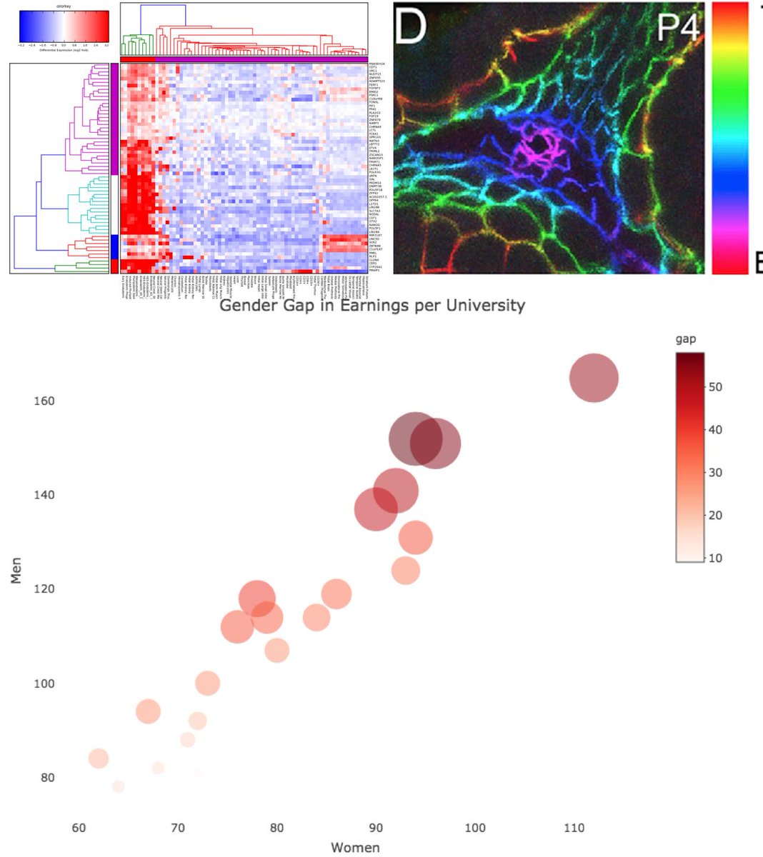
Be careful of using full saturation elements-will battle each other on the page.
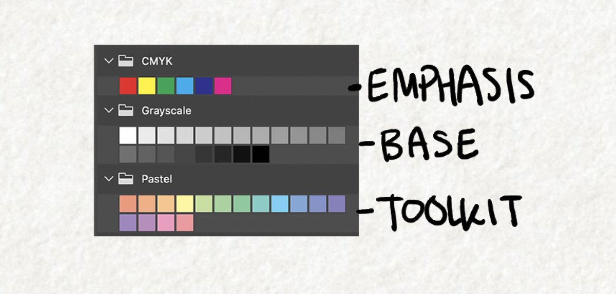
Grays are your base, desaturated hues are tools for differentiation and categorization, and your brights are for emphasis!
Add contrast!
Color is an easy way to do it.
Be careful of using full saturation elements-will battle each other on the page.
Grays are your base, desaturated hues are tools for differentiation and categorization, and your brights are for emphasis!
Or course, you need to be mindful of colorblindness! There are lots of materials you can check on making your #sciviz accessible!
uxdesign.cc/color-blindnes…
uxdesign.cc/color-blindnes…
It is important to check your tone
(if you made your image black and white, would there be a range of whites to darks? Would your key elements read as the same or different shades of gray?)
as an additional differentiating factor!
(if you made your image black and white, would there be a range of whites to darks? Would your key elements read as the same or different shades of gray?)
as an additional differentiating factor!
#Design for #Sciviz tip #7:
Don't forget your labels. Often I think people treat labels as an afterthought, but they're very important.
Try and consider these early in your design of a figure or slide.
What does your audience already know? What is obvious and can be cut?
...
Don't forget your labels. Often I think people treat labels as an afterthought, but they're very important.
Try and consider these early in your design of a figure or slide.
What does your audience already know? What is obvious and can be cut?
...
Ahhh #storyboarding! Will touch on this a bit later this week! But a teaser...
Don't worry about the hero's journey first.
Start with a #narrative timeline:
1. Who is your protagonist? Immune cells?
2. Antagonist or supporting players? Bacteria?
3. Define setting...
(1 of 5)
Don't worry about the hero's journey first.
Start with a #narrative timeline:
1. Who is your protagonist? Immune cells?
2. Antagonist or supporting players? Bacteria?
3. Define setting...
(1 of 5)
... where are you? The lungs? (maybe start with a wide angle, then zoom in, and in).
4. Define your problem. Bacterial infection spreading!
5. Counter action. Immune system attacks!
6. Overcoming, or reaction. Bacterial infection shrinks?
7. Wrap up ...
(2 of 5)
4. Define your problem. Bacterial infection spreading!
5. Counter action. Immune system attacks!
6. Overcoming, or reaction. Bacterial infection shrinks?
7. Wrap up ...
(2 of 5)
... call to action? moral? "That's how..." explainer
Basically, the thing to remember with animation, #1 mistake is writing out of linear time order. Unlike text, your timeline is more rigid. Can't see the immune cells attack until that character is introduced to us.
(3 of 5)
Basically, the thing to remember with animation, #1 mistake is writing out of linear time order. Unlike text, your timeline is more rigid. Can't see the immune cells attack until that character is introduced to us.
(3 of 5)
#Design for #Sciviz Tip 1:
Keep it simple (as you can). No.1 issue I run into with clients is they want to put every bit of their research in every image. Maybe ok for numbered figs, but not in your visual abstract, not in your PPT presentation!
Keep it simple (as you can). No.1 issue I run into with clients is they want to put every bit of their research in every image. Maybe ok for numbered figs, but not in your visual abstract, not in your PPT presentation!
At each step, whether working with a #sciart designer, or DIY, ask yourself "what is most important here" and "how can I #communicate that most clearly?"
Ask yourself what is noise in your message, and may prevent your audience from understanding (or even reading) your work. If it is unreadable, there is NO POINT in having every detail in there!
After Antarctica and some backpacking, my Antarctica money ran out. Luckily I had a job lined up at Çatalhöyük @catalhoyuk_arch - a posterchild site for post-processual #archaeology!
My first full time #sciart gig as a archaeological illustrator!
catalhoyuk.com
My first full time #sciart gig as a archaeological illustrator!
catalhoyuk.com
I'd like to spotlight the ongoing #archaeological #illustration of Çatalhöyük illustrator @kjkillackey who was a great help in showing me the ropes, and her incredible work!
(Katy hope you don't mind I pulled this image from your feed.)
(Katy hope you don't mind I pulled this image from your feed.)

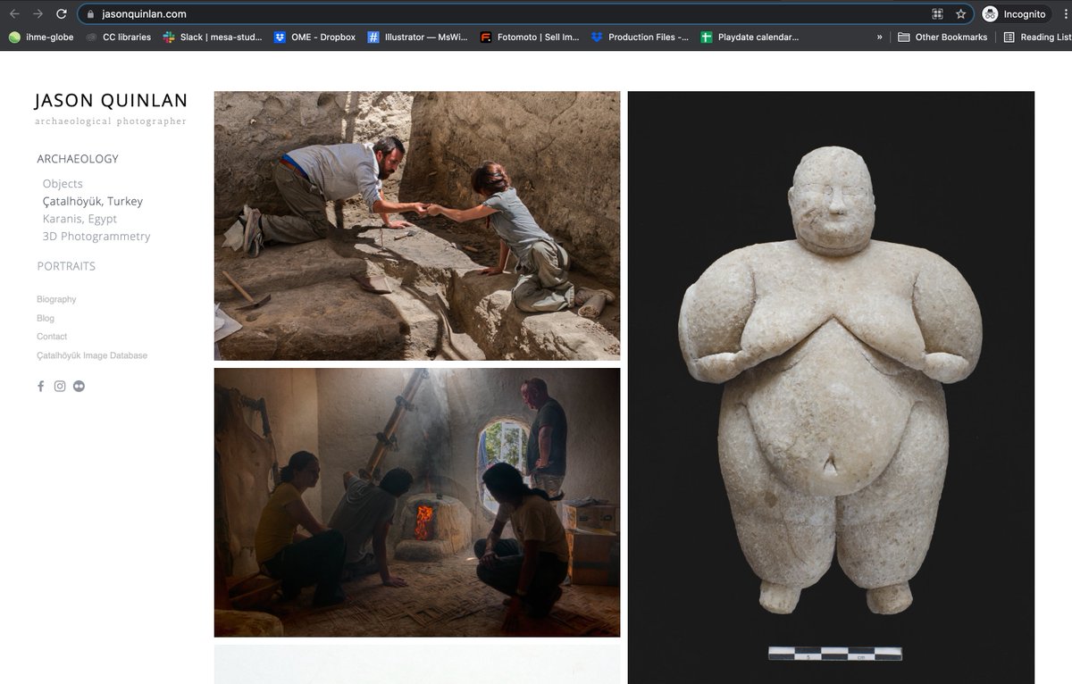
Also part of our little Çatalhöyük #sciviz office there was @jasonq, archaeological #photographer whose work you can see here: jasonquinlan.com (screenshot here)
Jason did a lot of climbing in scaffolding to get useful overhead shots of the dig!
Jason did a lot of climbing in scaffolding to get useful overhead shots of the dig!
After college, I spent some time traveling and working, and improving my #sciart skills.
The first place I went was Amundsen–Scott South Pole Station in #Antarctica (the #southpole).
I worked as a dishwasher, met my future husband, and saw some pretty neat climate science!
The first place I went was Amundsen–Scott South Pole Station in #Antarctica (the #southpole).
I worked as a dishwasher, met my future husband, and saw some pretty neat climate science!

During the summer, most operations workers at #southpole live in "Summer camp" a half mile from station.
It is a cluster of Jamesway tents on the ice flat. Home sweet home!
The warmest day that summer was -9° F, and the coldest as I left was about -60° F. That is cold!
It is a cluster of Jamesway tents on the ice flat. Home sweet home!
The warmest day that summer was -9° F, and the coldest as I left was about -60° F. That is cold!

One of the coolest things down there is @uw_icecube IceCube Neutrino Observatory, doing some #neutrino #physics!
Sensors deep in the ice can catch neutrino interactions in ice (heavy water also works in mine shafts)!
Here's a nice #sciviz by Fermilab
Sensors deep in the ice can catch neutrino interactions in ice (heavy water also works in mine shafts)!
Here's a nice #sciviz by Fermilab
I'm a #sciviz freelancer...
Institutions & individuals contract me for help communicating science. I collaborate with researchers, designers, journalists, or comms to execute the right visuals for the audience.
This #sciart for @TheScientistLLC
Institutions & individuals contract me for help communicating science. I collaborate with researchers, designers, journalists, or comms to execute the right visuals for the audience.
This #sciart for @TheScientistLLC

On any given week I may be juggling:
Multiple Figs and visual abstracts
Journal cover submission
Patient ed animation
Biotech campagin storyboarding
Zoo sign species ID #illustrations
Helping craft a @NatGeo #infographic
Kids puzzles!
#Textbook graphics
Science #editorial
...
Multiple Figs and visual abstracts
Journal cover submission
Patient ed animation
Biotech campagin storyboarding
Zoo sign species ID #illustrations
Helping craft a @NatGeo #infographic
Kids puzzles!
#Textbook graphics
Science #editorial
...
Today here at @iamscicomm I'm focusing a bit on my world - the world of science adjacent #sciart and #sciviz folks who support researchers with graphic #scicomm.
I mentioned yesterday I stared down a STEM career path, but found what I really loved was communicating that science!
I mentioned yesterday I stared down a STEM career path, but found what I really loved was communicating that science!
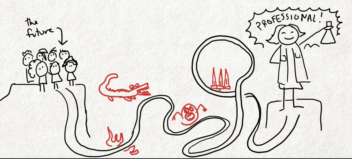
So where does a person go from there? For the record, everyone thought this was a poor career choice. I
1. Dropped my minor
2. Dropped the weed-out pre-med courses
3. Started drawing every day
4. Started teaching myself software
5. Started contacting #sciviz folks for advice
1. Dropped my minor
2. Dropped the weed-out pre-med courses
3. Started drawing every day
4. Started teaching myself software
5. Started contacting #sciviz folks for advice
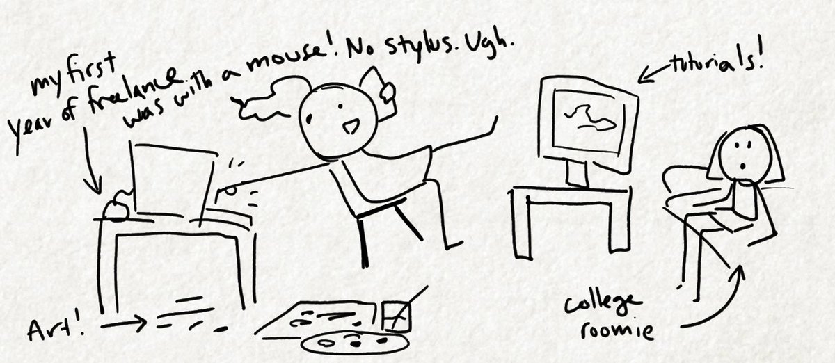
Asking advice is important when considering a #STEM career. I had access to a lot of people in research and medicine to talk to and help me.
Unfortunately, this is not as easy for everyone. How do you make yourself accessible for students or potential entrants to your field? ❓
Unfortunately, this is not as easy for everyone. How do you make yourself accessible for students or potential entrants to your field? ❓
Last day with me @helenajambor on #sciviz #visualisations. Today to wrap up let's briefly discuss color and layout.


