Discover and read the best of Twitter Threads about #ui
Most recents (24)
"Product Design is not UX Design is not UI Design is not..."
Look, if you're doing the job right, it's all the same shit.
It's all DESIGN.
Every description I've ever read about any of the above disciplines applies to ALL THREE if you're going to be any good at it.
1/6
Look, if you're doing the job right, it's all the same shit.
It's all DESIGN.
Every description I've ever read about any of the above disciplines applies to ALL THREE if you're going to be any good at it.
1/6
If you're going to make an impact. Get results. Help people.
Design of ANY kind, in general, is a holistic pursuit — you have to know a hell of a lot about a hell of a lot that is far beyond the actual tactical work you do.
2/6
Design of ANY kind, in general, is a holistic pursuit — you have to know a hell of a lot about a hell of a lot that is far beyond the actual tactical work you do.
2/6
Stuff that is beyond the principles and practices of good UX, good design.
Into the realm of business, technology, engineering, human psychology, cognitive behavior, the list goes on.
3/6
Into the realm of business, technology, engineering, human psychology, cognitive behavior, the list goes on.
3/6
1/ 🚀 Yesterday, @Humane demoed their upcoming product touted to bring the power of #AI into the physical world.
I've been looking at their patents for a while now, and wanted to share some experimentation with this new form factor! #Humane
I've been looking at their patents for a while now, and wanted to share some experimentation with this new form factor! #Humane
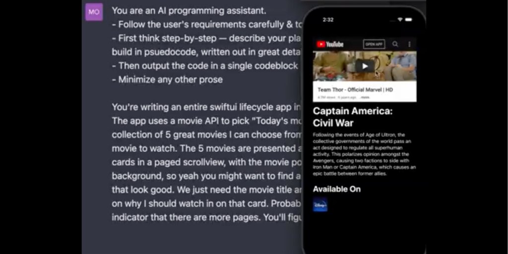
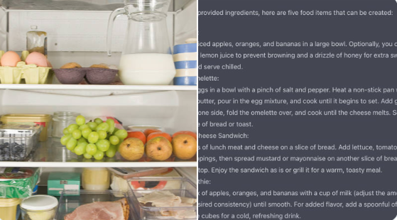
Incredible GPT-4 uses in just a few days! Super inspiring summary thread 🧵👇
#ui #ui #uidesign #ux #uxdesign #design #innovation #AI #ArtificalIntelligence #games #microsoft #powerpoint #food #recipes #chatbot #business #money #OpenAI #code #programming #webdev #ios #iphone


#ui #ui #uidesign #ux #uxdesign #design #innovation #AI #ArtificalIntelligence #games #microsoft #powerpoint #food #recipes #chatbot #business #money #OpenAI #code #programming #webdev #ios #iphone

1. Microsoft Copilot
GPT4 in powerpoint, excel, word, outlook, teams, more.
blogs.microsoft.com/blog/2023/03/1…
GPT4 in powerpoint, excel, word, outlook, teams, more.
blogs.microsoft.com/blog/2023/03/1…
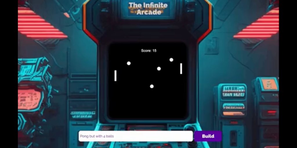
2. Arcade Game
@thegarrettscott made a website that uses GPT-4 to code any arcade game you can think of and let you play it instantly.
@thegarrettscott made a website that uses GPT-4 to code any arcade game you can think of and let you play it instantly.
10 Useful Design Systems to Learn From (Mega thread) 👇🧵
#ui #uidesign #ux #uxdesign #design #productdesign #designsystems #uikit #sketch #figma #adobexd #google #apple #ibm #airbnb #audi #shopify #ecommerce #atlassian #webdev #ios #materialdesign #iphone #react #js #css


#ui #uidesign #ux #uxdesign #design #productdesign #designsystems #uikit #sketch #figma #adobexd #google #apple #ibm #airbnb #audi #shopify #ecommerce #atlassian #webdev #ios #materialdesign #iphone #react #js #css


2. Apple
The Human Interface Guidelines contains guidance and best practices that can help you design a great experience for any Apple platform
developer.apple.com/design/human-i…
The Human Interface Guidelines contains guidance and best practices that can help you design a great experience for any Apple platform
developer.apple.com/design/human-i…
👉🏻 Découvre 25 plugins Figma !
☀️ Je te file ma petite liste perso de plugins à ajouter à ton figma et à tester sur un projet ! #graphisme #ui #design #graphicdesign #tool #figma #plugin
Thread 👇🏻
☀️ Je te file ma petite liste perso de plugins à ajouter à ton figma et à tester sur un projet ! #graphisme #ui #design #graphicdesign #tool #figma #plugin
Thread 👇🏻

Usability pitfalls of disabled buttons
Disabled buttons can cause users to get blocked without knowing why, causing abandonment and frustration.
Tips on how to deal with disabled buttons from @vitalyf's video course - Smart Interface Design Patterns 👇
#design #ui #ux #uxui
Disabled buttons can cause users to get blocked without knowing why, causing abandonment and frustration.
Tips on how to deal with disabled buttons from @vitalyf's video course - Smart Interface Design Patterns 👇
#design #ui #ux #uxui

I've been asked several times by newbies in #uiuxdesign how to get started into ui/ux design.
Got tired of explaining,so I put together a little something to help you in a simple and easy-to-understand way. Perfect for beginners! #UI #UX #Design #BeginnerTips
🧵👇
Got tired of explaining,so I put together a little something to help you in a simple and easy-to-understand way. Perfect for beginners! #UI #UX #Design #BeginnerTips
🧵👇
Everything you need to help you get started.
notion.so/Getting-Starte…
Some popular designers like @LizTheWhizard @daviowhite @TheRuqayyah @ConfidentNuel @mizko @michalmalewicz were also featured 😁
Goodluck and a nice day
notion.so/Getting-Starte…
Some popular designers like @LizTheWhizard @daviowhite @TheRuqayyah @ConfidentNuel @mizko @michalmalewicz were also featured 😁
Goodluck and a nice day
Retweet until it gets to every new designer out there 🙏👍
👉 2023 - Top UI UX Trends you need to know🔥🚀
As we explore UI UX Trends 2023, #Adobe's $20 billion acquisition of #Figma still surprises us.
A UI UX collaborative prototyping tool costing so much is unbelievable. #UI #UX has evolved into a crucial business process.
👇Thread
As we explore UI UX Trends 2023, #Adobe's $20 billion acquisition of #Figma still surprises us.
A UI UX collaborative prototyping tool costing so much is unbelievable. #UI #UX has evolved into a crucial business process.
👇Thread

Top UI Design Trends of 2023🔥
• Large font size and immersive experience
• No more parallax scrolling
• Generative AI in the design process
• Make full use of the card UI component
• Light mode with an option for dark mode
• Large font size and immersive experience
• No more parallax scrolling
• Generative AI in the design process
• Make full use of the card UI component
• Light mode with an option for dark mode
UI Designer vs. UX Designer vs. Product Designer: A Comparative Analysis
-
-
See thread👇
-
-
#uidesign #UI #design #uxdesign #uiuxdesign #productdesign #musemind
-
-
See thread👇
-
-
#uidesign #UI #design #uxdesign #uiuxdesign #productdesign #musemind

📚기획 용어 시리즈 모음
구글링을 해도 명확하게 뜻이 나오지 않거나 선배 동료에게 물어보기에 애매한 용어들. 실제 프로젝트를 진행하거나 Teaching을 하면서 입문자들이 가장 많이 물어보시는 부분과 실제 작업 시 필수 Use case 위주로 용어의 의미와 활용에 대해 소개합니다.
구글링을 해도 명확하게 뜻이 나오지 않거나 선배 동료에게 물어보기에 애매한 용어들. 실제 프로젝트를 진행하거나 Teaching을 하면서 입문자들이 가장 많이 물어보시는 부분과 실제 작업 시 필수 Use case 위주로 용어의 의미와 활용에 대해 소개합니다.

1부: 웹, 앱 UI 설계 전 알아야 하는 기본 개념
: yozm.wishket.com/magazine/detai…
2부: UI 기획 시 알아야 하는 기초 용어
: yozm.wishket.com/magazine/detai…
3부: 이커머스 페이지 기획 시 알아야 하는 기본 용어
: yozm.wishket.com/magazine/detai…
: yozm.wishket.com/magazine/detai…
2부: UI 기획 시 알아야 하는 기초 용어
: yozm.wishket.com/magazine/detai…
3부: 이커머스 페이지 기획 시 알아야 하는 기본 용어
: yozm.wishket.com/magazine/detai…
4부: 검색 기획/설계를 위한 기본 용어 알고 가기
: yozm.wishket.com/magazine/detai…
5부: 인터랙션/제스처 알아가기
: yozm.wishket.com/magazine/detai…
6부: 시작하기 프로세스 기초개념 알기
: yozm.wishket.com/magazine/detai…
: yozm.wishket.com/magazine/detai…
5부: 인터랙션/제스처 알아가기
: yozm.wishket.com/magazine/detai…
6부: 시작하기 프로세스 기초개념 알기
: yozm.wishket.com/magazine/detai…
You can imagine incredibly creative watch concepts with #midjourney #ui All prompts available in the image descriptions 🧵 

For #ui designers try asking #midjourney for #streetwear interface designs. Pretty amazing results. Check the ALT tag for the prompt template and share your creations. 🧵 

Would be difficult to give an answer in a thread without sounding a bit reductive, but I'll try my best!
The way I personally see it, the #UI #UX tendencies are shaped by such factors as:
1. The economy (the main one)
2. Accumulation of knowledge
3. Software/Hardware
🧵1/?
The way I personally see it, the #UI #UX tendencies are shaped by such factors as:
1. The economy (the main one)
2. Accumulation of knowledge
3. Software/Hardware
🧵1/?
2/?
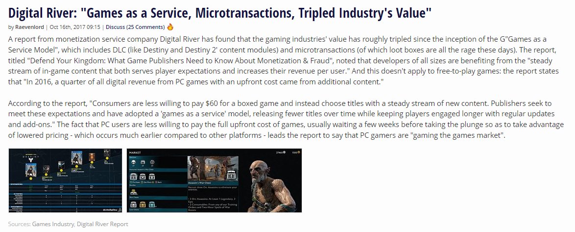
1. The economy - since we're living in a profit-driven system, this inevitably impacts all facets of our lives, eg video games
Within such system, the pursuit for the most effective ways of extracting profit can oftentimes lead to standardization of approaches and practices
1. The economy - since we're living in a profit-driven system, this inevitably impacts all facets of our lives, eg video games
Within such system, the pursuit for the most effective ways of extracting profit can oftentimes lead to standardization of approaches and practices
Ask #midjourney for a cooking app #UI You wont be disappointed by the unique looking food dishes. Any of these look appetizing? 

For #UI designers, #midjourney is a new way to find inspiration for layout and style. Is this plus #chatgpt3 the future of experience design? 

🔖 Design inspiration! Where do you find interesting websites? Below is the list of websites that I frequently visit to explore some unusual designs for inspiration:
– Minimal design (httpster.net/2022/nov/) curated by Dominic Whittle and Tom Fitzgerald at Guvnor,
– Minimal design (httpster.net/2022/nov/) curated by Dominic Whittle and Tom Fitzgerald at Guvnor,
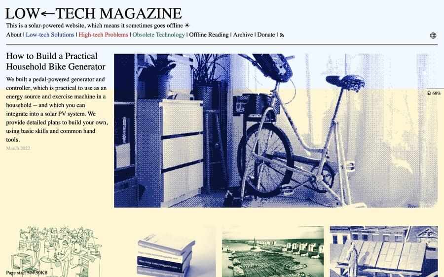
– Low Carbon Websites (lowwwcarbon.com) curated by @Nickylewlew,
– One Page Love (onepagelove.com), with landing pages, templates and resources, curated by @robhope,
– Interaction patterns DesignVault (designvault.io), curated by @daleanthony
– One Page Love (onepagelove.com), with landing pages, templates and resources, curated by @robhope,
– Interaction patterns DesignVault (designvault.io), curated by @daleanthony
– Design made in Germany (designmadeingermany.de/galerie/websei…) by Andrea Bertsche,
– Japanese Design (responsive-jp.com) curated by Katoshun,
– Cyrillic design (cyrillic.design),
– Dark Mode Design (darkmodedesign.com)
– Japanese Design (responsive-jp.com) curated by Katoshun,
– Cyrillic design (cyrillic.design),
– Dark Mode Design (darkmodedesign.com)
If you want to get FREE UI Kits and Design Inspiration For Front-End Developers, read this 👇
1️⃣ Uistore UI Kits
Free handpicked UI Kits for your real-life projects.
Curated free design resources to energize your creative workflow.
uistore.design/categories/ui-…
Free handpicked UI Kits for your real-life projects.
Curated free design resources to energize your creative workflow.
uistore.design/categories/ui-…

2️⃣ Free Design Resources
Handpicked free UI Kits to use on your web and mobile application. Ranging from simple to complex.
freedesignresources.net/category/free-…
Handpicked free UI Kits to use on your web and mobile application. Ranging from simple to complex.
freedesignresources.net/category/free-…

Hey #GameDev / #GameDesign!
Tired of seeing game dev students who don't know how to make prototypes, or don't know how to be creative?
My students have just finished submitting their "Experimental Games" courseworks, and I couldn't be more proud of them.
Check out this🧵!
Tired of seeing game dev students who don't know how to make prototypes, or don't know how to be creative?
My students have just finished submitting their "Experimental Games" courseworks, and I couldn't be more proud of them.
Check out this🧵!
Taha (@TeeheeYolk) chose to explore player perspective my mashing up FPS and Platformer sections.
The result is discomforting and odd, but definitely creative!
The result is discomforting and odd, but definitely creative!
Riley (@AllanRiley123) looked at #UI placement, and asked why we use the outside of the screen and not the inside.
Might seem counter-intuitive at first, but is it really as intrusive as you'd think?
Might seem counter-intuitive at first, but is it really as intrusive as you'd think?
How to create custom inputs in @bubble⭐️
All with no-code, no custom states and no workflows.
🧵👇
#nocode #bubble #bubbleio #ui #buildinpublic
All with no-code, no custom states and no workflows.
🧵👇
#nocode #bubble #bubbleio #ui #buildinpublic
Step 1
Create a ”Align to Parent” group.
This will allow us to add elements with different z-index which we will need for the text to both me non-clickable but also on top of the input element.
Create a ”Align to Parent” group.
This will allow us to add elements with different z-index which we will need for the text to both me non-clickable but also on top of the input element.
Step 2
Add a text element.
The order here is important❗️
If you were to add the input element first, the text would be above the input and users would not be able to click the text to write, not good.
Add a text element.
The order here is important❗️
If you were to add the input element first, the text would be above the input and users would not be able to click the text to write, not good.
A significantly large number of companies and organizations share three specific traits when it comes to #UX improvement and #ProductDesign in general:
1 - They don’t really know what their users or customers actually want.
(1/13)
1 - They don’t really know what their users or customers actually want.
(1/13)
2 - They’re under the mistaken assumption that surveys or their NPS scores tell them what the value of their product/service is to those users.
3 - They’re not willing to allow you to talk to those users to find out what they actually need or hope to accomplish.
(2/13)
3 - They’re not willing to allow you to talk to those users to find out what they actually need or hope to accomplish.
(2/13)
I get enough emails and DMs every day to tell me that this is reality for most of you. And the question folks ask me is always the same:
What the hell do I DO?
My answer tends to ruffle some feathers, but here it is.
(3/13)
What the hell do I DO?
My answer tends to ruffle some feathers, but here it is.
(3/13)
I often post pics of the @Airbus #A350 flightdeck and get lots of questions about what is where and what does that do…so a little thread to help explain the screens and options that #WePilots have with them using my limited knowledge. First… the middle #aviation #airbus #Pilot 

The two centre screens are electronically split into four. The upper two give information such as systems on left and anomalies on right. Lower are used to give the aircraft information from the pilots, such as route, weather, speeds, performance details, etc. #aviation 

The displays in front of either pilot are configurable as the pilot wishes. The inboard display is seen here with camera and airfield navigation system displayed but it can also be primary flight instruments and navigation. The outboard is our Electronic Flight Bag. #aviation 

Time for a little sneak peek of the #UE5 #UI optimization notes I'm writing. Optimizing UI and Slate is often challenging as people aren't always aware of what's expensive within this system. We're hoping to illuminate that a bit! Here's a🧵 with some of the bigger stuff.
First off, avoid Canvas Panels whenever you can. Slate groups draw calls by LayerID. Whereas other containers condense the number of draw calls by consolidating child elements' LayerIDs, Canvas Panels increment them, so they use MULTIPLE draw calls. This makes them CPU intensive.
The reason Canvas Panels do this is to support rendering child elements on top of each other if need be. To be clear, Canvas Panels are great for highly detailed layouts or instances where you need complex Z-ordering. It's totally permissible to use them as, say, the root of a UI
Ok, let's try something different. Useful technical/business thread for #web #makers from me.
🔌 How to build @atlassian Jira App (in #React) and business around it and why you should actually think of it!
Thread: 🧵
🔌 How to build @atlassian Jira App (in #React) and business around it and why you should actually think of it!
Thread: 🧵
@Atlassian 2/12 We started @testomatio (test management system for #qa) as a classical #SaaS app but at some point, we built a Jira plugin as a complimentary interface.
The feedback from clients surprised us. Some clients preferred to use @testomatio only via Jira plugin
Why? 👇
The feedback from clients surprised us. Some clients preferred to use @testomatio only via Jira plugin
Why? 👇
3/12 Jira is still the source of truth for many companies in the world. And if you want to win small & big you should adjust to business needs. And business works primarily on Jira.
One unobvious conclusion:
Business doesn't want to have another app or even leave Jira
One unobvious conclusion:
Business doesn't want to have another app or even leave Jira
