Discover and read the best of Twitter Threads about #dropoff
Most recents (2)
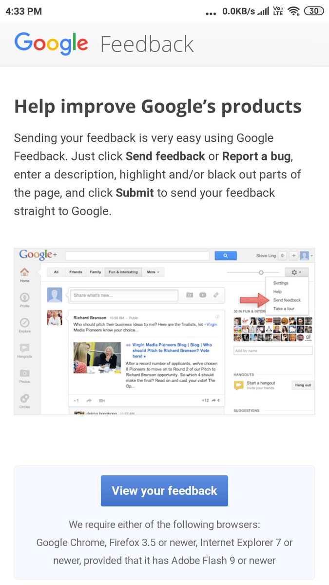
All talks no action. Google #Feedback Forum #CX / #ServiceDesign. No text box to dump feedback with one click. Not responsive. Not mobile friendly. Poor #UX with high first threshold of user feedback. @Google 

Encourage people to first dump the feedback then further categories. That way team will have feedback to analyze. If you expect people to look for the category then add the feedback, let me tell you in B2C, consumers will simply drop off. @Google
Isn't all User Research of existing services starts from User Feedback. In view of such a User Unfriendly poorly design feedback page, I wonder where does the UX Research budget goes? @Google #uxresearch #dropoff
#Cart #Checkout #ecommerce #Interactions #InteractionDesign #UX #UserExperience #Checkout #UserJourney #UserFlow #IA #InformationArchitecture #Sales #ROI #Dropoff #Bouncerate #Flight #booking #Amazon #Flipkart.
New Interaction for Checkout User Flow.
New Interaction for Checkout User Flow.
Checkout flow have 5-7 screens starting from Cart to Payment Gateway. Imagine the first screen as a Card. These Cards slide down as we press Next. A new card adds at the top with the next set of info. Next & Back arrow at the top of the new card. That way all the information
will be on one page at all point of time throughout the process. Slide down & Review any info at any point of time just before moving into Payment Gateway.
#Quantitative #Analytics #DigitalMarketing #Digital #CreativeCommon #patent #DesignPatent #Wallmart #Mart #Shopify #Magento
#Quantitative #Analytics #DigitalMarketing #Digital #CreativeCommon #patent #DesignPatent #Wallmart #Mart #Shopify #Magento
