Discover and read the best of Twitter Threads about #animated
Most recents (2)
After an amazing response last week, I’m super excited to LAUNCH TODAY my FREE #SciComm #YouTube tutorial series for #Scientists & #researchers across disciplines on how to create your own #animated #videos for #Science #Communication. Pls SUBSCRIBE & RT! 5 videos to start! 1/7 

Video 1 - SciComm: #Animation training for Scientists - A brief introduction to this #tutorial series 2/7
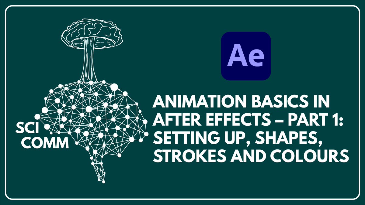
Video 2 - SciComm: Animation basics in #aftereffects – Part 1 - setting up, basic shapes, strokes and colours 3/7


1/4 There's a lot of data & analyses out there. However, for some people, such info is still not easily reachable. Based on that, data visualization can help even non-experts to have an idea of what's going on. Look at the animated plot below, for example:
2/4 I loved it! I instantly felt like reproducing it. For now, I did it for countries in the world. Every point is a country. The more it goes UP, the more people in such countries stayed at home. The more it goes LEFT the fewer people in such countries went to workplaces. The
3/4 bigger the point, more cases. These variations are compared to the period of Jan3-Feb6, that is, before the beginning of social distancing measures. If you liked it and you want to see + tweets like this and/or want the documented source code so that you can do it too, like
