Discover and read the best of Twitter Threads about #Matplotlib
Most recents (17)
Roadmap to becoming Data Analyst in three months absolutely free. No need to pay a penny for this.
I have mentioned a roadmap with free resources.
A thread🧵👇
I have mentioned a roadmap with free resources.
A thread🧵👇

1. First Month Foundations of Data Analysis
A. Corey Schafer - Python Tutorials for Beginners:
B. StatQuest with Josh Starmer - Statistics Fundamentals:
C. Ken Jee - Data Analysis with Python
A. Corey Schafer - Python Tutorials for Beginners:
B. StatQuest with Josh Starmer - Statistics Fundamentals:
C. Ken Jee - Data Analysis with Python
2. Second Month - Advanced Data Analysis Techniques
A. Sentdex - Machine Learning with Python
B. StatQuest with Josh Starmer - Machine Learning Fundamentals
C. Brandon Foltz - Business Analytics
A. Sentdex - Machine Learning with Python
B. StatQuest with Josh Starmer - Machine Learning Fundamentals
C. Brandon Foltz - Business Analytics
1. Python Basics
Codecademy's Python Course (codecademy.com/learn/learn-py…)
Python for Everybody Course (py4e.com)
Codecademy's Python Course (codecademy.com/learn/learn-py…)
Python for Everybody Course (py4e.com)
2. Data Analysis Libraries
NumPy User Guide (numpy.org/doc/stable/use…)
Pandas User Guide (pandas.pydata.org/docs/user_guid…)
Matplotlib Tutorials (matplotlib.org/stable/tutoria…)
NumPy User Guide (numpy.org/doc/stable/use…)
Pandas User Guide (pandas.pydata.org/docs/user_guid…)
Matplotlib Tutorials (matplotlib.org/stable/tutoria…)

Are you a #Python enthusiast? Here are the top 5 most useful scripts in Python that you should know!
💪🏽
💪🏽
1. Web Scraping: Python offers a powerful library called BeautifulSoup that allows you to extract data from HTML and XML files. With this library, you can easily scrape data from websites and use it for various purposes like data analysis and machine learning. 

2. Data Visualization: #Python has several libraries like #Matplotlib, #Seaborn, and Plotly that make data visualization easy and effective. You can create beautiful and interactive graphs, charts, and maps with just a few lines of code. 

I am a great fan of the @Medium platform and know its subscriber for almost a year now. It's part of my daily routine to go through its daily recommendations every morning. Here is my collection of bookmarked articles maybe someone will find it useful, so sharing the links 1/n
Happy to announce my new course Mapping and Data Visualization with #Python. This has been in the making for over a year and excited to be able to share it with the world! The full course is free for self-study and shared under an open license. An overview thread below 👇 1/n
We start with the overview of the Python data visualization landscape and zero in on the core libraries for mapping. Day 1 covers vector data visualization with #Maptplotlib, #Pandas, #GeoPandas, and #Contextily (2/n) 


Day 2 starts with a deep dive into XArray and raster data visualization. We use #Xarray, #rioxarray and #CartoPy to visualize elevation and gridded climate datasets and learn some advanced #Matplotlib tricks. (3/n) 


Interested in learning more about #DataScience, #MachineLearning or #AI? I’ve got a few places and resources for medics to start with. Anyone can do it with enough time and effort! Soon enough you’ll be making your own neural networks
1/16. A thread 🧵.
1/16. A thread 🧵.

2/16. Everyone has their preferences with programming languages. However if you’re starting from scratch, I highly recommend #Python. It is easy to learn, has a wide variety of applications and you will find it is much easier to perform even the most basic of statistics. 

3/16. It also gives you access to multiple libraries that are used heavily by the machine learning community such as #Keras, #TensorFlow and #PyTorch. 

[Data Analysis] 🧵
Exploratory data analysis is a fundamental step in any analysis work. You don't have to be a data scientist and be proficient at modeling to be a useful asset to your client if you can do great EDA.
Here's a template of a basic yet powerful EDA workflow👇
Exploratory data analysis is a fundamental step in any analysis work. You don't have to be a data scientist and be proficient at modeling to be a useful asset to your client if you can do great EDA.
Here's a template of a basic yet powerful EDA workflow👇
EDA is incredibly useful. Proper modeling CANNOT happen without it.
The truth:
Stakeholders NEED it far more than modeling.
EDA empowers the analyst with knowledge about the data, which then moderates the #machinelearning pipeline
The truth:
Stakeholders NEED it far more than modeling.
EDA empowers the analyst with knowledge about the data, which then moderates the #machinelearning pipeline
While #pandas and #matplotlib are key to good EDA in #python, the real difference are the QUESTIONS you ask to your dataset.
As in all things, these tools are just tools. The real weapon is the analyst. You are in control, not the dataset.
As in all things, these tools are just tools. The real weapon is the analyst. You are in control, not the dataset.
If you want to learn about #bioimageanalysis I've written a free & open textbook that tries to help:
bioimagebook.github.io
Thanks to the wonder of @ExecutableBooks & other modern magic it's not quite like a normal book... (thread)
@OpenEdEdinburgh @NEUBIAS_COST @BioimagingNA
bioimagebook.github.io
Thanks to the wonder of @ExecutableBooks & other modern magic it's not quite like a normal book... (thread)
@OpenEdEdinburgh @NEUBIAS_COST @BioimagingNA
First, the book tries to cover the main concepts, independently of any software, in a practical way.
This includes common pitfalls & problems, like data clipping, that can doom analysis from the start (2/n)
This includes common pitfalls & problems, like data clipping, that can doom analysis from the start (2/n)
It also includes tricky stuff important for a lot of microscopy image analysis, like noise distributions & the signal-to-noise ratio... (3/n)
What's an image made of?
There are many correct answers.
But the most fascinating one is: << sines & cosines >>
Read on if you're intrigued👇🧵🪡
#python #images #fourier
There are many correct answers.
But the most fascinating one is: << sines & cosines >>
Read on if you're intrigued👇🧵🪡
#python #images #fourier
If you want to create great data visualizations, you need to understand color palettes.
Here are a few quick tips:
[1/n]
#datascience #datavisualization #Python #rstats
Here are a few quick tips:
[1/n]
#datascience #datavisualization #Python #rstats
[2/n]
For data that has a sequential ordering (i.e., low to high), you should use sequential color scales.
matplotlib.org/stable/tutoria…
#Python #matplotlib
For data that has a sequential ordering (i.e., low to high), you should use sequential color scales.
matplotlib.org/stable/tutoria…
#Python #matplotlib

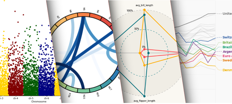
1/5 One more example by @CedScherer showing how to add proper labels on a line chart:
R: r-graph-gallery.com/web-line-chart…
Python: python-graph-gallery.com/web-line-chart…
R: r-graph-gallery.com/web-line-chart…
Python: python-graph-gallery.com/web-line-chart…

2/5 One more example by @alextuowang: a good looking radar chart:
R: r-graph-gallery.com/web-radar-char…
Python: python-graph-gallery.com/web-radar-char…
btw, I know radar chart are criticised:
data-to-viz.com/caveat/spider.…
R: r-graph-gallery.com/web-radar-char…
Python: python-graph-gallery.com/web-radar-char…
btw, I know radar chart are criticised:
data-to-viz.com/caveat/spider.…

Will Slovakia avoid „Czech scenario“?
Health minister #marekkrajčí 16.10. first time publicly compared the second wave COVID-19 trends in Slovakia and Czech republic in a chart showing that Slovakia is following the scenario in Czech republic with a delay of 2~3weeks.:
Health minister #marekkrajčí 16.10. first time publicly compared the second wave COVID-19 trends in Slovakia and Czech republic in a chart showing that Slovakia is following the scenario in Czech republic with a delay of 2~3weeks.:

Trend chart from few days ago (22.10.) was even worse and clearly showing that Slovakia is repeating the Czech scenario: 

Somewhere here we should be looking for motivation of the government in Slovakia and prime minister #igormatovič to solve the problem of rising second wave of epidemics and dark vision of collapsing health care by unusual way - #masstesting in combination with limited lockdown.
A 2+ meses de iniciar el proyecto de vigilancia genómica, el equipo en @CayetanoHeredia ha secuenciado 131 genomas peruanos de SARS-CoV-2 de marzo-agosto 2020. Junto a 146 secuencias del @INS_PERU nos permiten entender los eventos iniciales de la pandemia en Perú. 1/
El proyecto inició como una colaboración con @PUCP e INS. Ahora se suman @UNMSM_, @UNSA_Oficial de Arequipa, @untrm de Chachapoyas, @tumigenomics y el @sangerinstitute de Inglaterra. Financian @FondecytPeru, @VLIRUOS y @IDB_Lab 2/ 

El trabajo se dividió en tres equipos: (1) Procesamiento y extracción de ARN de muestras que llegan de INS, en un laboratorio BSL2+ acondicionado y certificado (en colaboración con @EmergeUpch). 3/ 


If you are using matplotlib in your day to day coding activity and didn't no the crux of it, I want to you take a look at this below thread. I'm sure you will learn and apply it.
So, here is what all we need to know about matplotlib, an excellent visualization library in python
So, here is what all we need to know about matplotlib, an excellent visualization library in python
I used Matlab for image processing for years. Tried to switch to Python 10 years ago but too many tools were still missing. Tried again 5 years ago and haven't touched Matlab ever since! The combination scikit-image + @ProjectJupyter was a real game-changer! A few more things:
On top of the great classics scientific stack (#numpy, #scipy, #pandas, #matplotlib) there's an entire ecosystem of new tools to handle all sorts of complex problems. E.g. #napari to visualize and annotate multi-dimensional data. @dask_dev to handle very large images.
Complex ML tools for image denoising like content-aware image restoration #CARE (github.com/csbdeep/csbdeep) or point-scanning super-resolution #PSSR (github.com/BPHO-Salk/PSSR) which are documented as Jupyter notebooks that really work "out of the box".


