Discover and read the best of Twitter Threads about #ElectionViz
Most recents (1)
Thread: How would YOU visualize poll tracker data? You have 50 US states and a race to 270 Electoral College votes. Here's a thread of several approaches from the media, with one pro/con for each. #ElectionViz (1/11) 

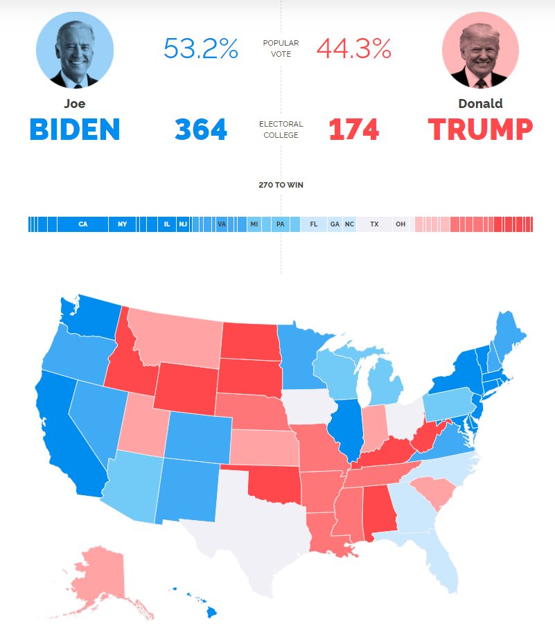
#YouGov goes for a traditional approach: stacked horizontal bar chart and standard US map.
Pro: Easy to find any particular state.
Con: Size is based on physical area, not number of electoral college votes
today.yougov.com/2020-president… (2/11)
Pro: Easy to find any particular state.
Con: Size is based on physical area, not number of electoral college votes
today.yougov.com/2020-president… (2/11)

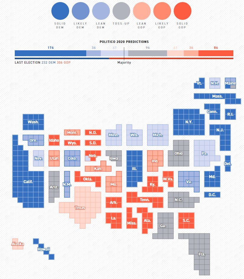
#Politico is similar but uses a tile map
Pro: each electoral college vote is the same size. States are sized according to EC. (British perspective: California gets loads of votes!)
Con: a bit harder to find a particular state. Unusual display.
politico.com/2020-election/… (3/11)
Pro: each electoral college vote is the same size. States are sized according to EC. (British perspective: California gets loads of votes!)
Con: a bit harder to find a particular state. Unusual display.
politico.com/2020-election/… (3/11)

