Discover and read the best of Twitter Threads about #2C2C2C
Most recents (1)
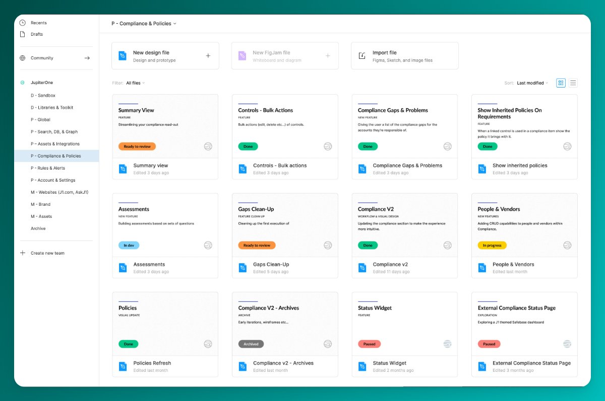
Feeling like your @figma account could use some tidying? I know, I've been there.
Here are the 8 steps I follow to build a file thumbnail component that's minimal, consistent, and scales:
Here are the 8 steps I follow to build a file thumbnail component that's minimal, consistent, and scales:

1. Make a Frame that's the right size (1600x960 suggested)
Name it 'File Thumbnail'
Name it 'File Thumbnail'
